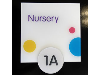
 If you have been a serious producer or promoter of ADA signs over the last twenty years, you probably understand what I’m talking about when I speak of the “Holy Grail of Braille signs.” It’s the search for that wonderful sign that won’t be picked apart, fall apart, disintegrate in water, warp or delaminate in the sun, have the color scratched off or wear away, take too long to make, or cost too much money.
This signage must not only be compliant with standards but actually be usable and readable by people with vision impairments, no vision, or normal vision.
And wouldn’t it be wonderful if it actually looked great, too?
Whew! I’m out of breath just thinking about what we’ve all gone through trying to find the answer since 1992—when some of us woke up to find that, from now on, many of our signs had to have Braille and raised letters.
When it was determined that Braille really did have to be rounded to be easily read, people figured out how to do that using all sorts of methods. Raster Braille was born to give us the perfectly rounded dot. And when it became clear to some of us that letters with a soft edge rather than a sharp, straight angle were much more readable by touch, you could even find etched metal signs with a shoulder that provided that needed bevel.
In the end though, some of the signs that we thought of as “one piece” started to come apart. It was also clear that a gel layer used to create raised graphics on a sign might not stay protected with surface paint forever. Moisture in the atmosphere would begin to destroy that sign just as easily as surface-applied characters could be picked off a carelessly manufactured acrylic sign.
For people who are blind, there are problems with even well made tactile signs. If the letters are large and bold enough for your partially sighted friends to see, they’re hard to read by touch.
You need fairly small characters (with big spaces in-between and very thin, rounded tops). You have to have all upper-case, sans serif letters, but people with some vision really benefit from upper- and lower-case and perhaps even a non-decorative serif typeface. Signs that are made for both touch and visual readers may satisfy neither group.
Since we’ve barely mentioned Braille, let’s answer the question that even some sign makers still ask. Why raised characters? People who are blind read Braille, don’t they? Actually only a small percentage of people who are legally blind read Braille.
So you see the need for no-problem raised characters and Braille. Enter thermoforming.
 Thermoforming uses heat and pressure to compress off-the-shelf sheet plastic into a prepared mold and create a sign with raised characters, Braille, and other decorative elements. Molds for standard signs can be used many times and are made with a computerized router/engraver. The size, height, and shape of the characters and Braille can be tightly controlled, and fine detail isn’t a problem. A true one-piece sign is produced.
Thermoforming is not a new technique. What is new is its introduction to the ADA sign industry.
Shops that own thermoforming equipment can learn to make their own molds. You can probably decorate the signs with methods you use now. You may not have the time or money to invest in thermoforming, but you can buy any part of the fabrication out and do the rest in your own shop.
The advantages of thermoforming for raised characters transfer right over to Braille. Just like rasters (but with the advantages of being completely integral with the sign rather than inserted separately), thermoformed Braille can have a perfect rounded shape and height.
The first step, obviously, in using the advantages of thermoforming to comply with the latest ADA rules for signs (which are now legally enforceable throughout the United States) is to design the signs correctly. That’s where the new rules provide you with a completely new design choice that’s particularly easy to achieve with thermoforming.
The rules allow you to have two completely separate signs, as long as they both identify the room or space (one with raised characters and Braille and the other with strictly visual text). You can also divide one sign into two sections: one raised and one flat. Of course, you can continue with the usual type of sign and make the room identification so that one set of characters is both raised and uses a contrasting color to make it stand out visually from the background.
With thermoforming, design the layout and prepare the production files as usual (but with more choices for the character shapes, as well as for decorating the signs). The new rules will apply for your usual ADA sign layouts, as well as to signs with separate visual/tactile messages.
To start, the raised characters must use a sans serif font. For signs where the same characters are both tactile and visual, you’ll no longer be able to use serif fonts at all for room identification. However if you use the new rules to make separate visual and raised characters, you can retain most of the serif fonts you use for the visual sign portion—and even use some bolder styles.
Although height of characters stays the same for the combined visual/tactile characters, if you’re making separate tactile characters, they can be as small as 1/2-inch in height.
 For Braille, dot size, shape, height, and position are now regulated. There are other new rules, including spacing between characters. Visual characters are allowed to have less space between them, than are the top surfaces of tactile characters.
Thermoforming is a method where you can control all these things precisely. You can get the benefits usually associated with integrally colored characters by printing the raised characters on the surface using a version of your font that is slightly larger, so the sides of the character will also be printed. If you do that, visual readers will see a bolder character, while touch readers will feel the slender spine of the raised character.
With thermoforming, you can even use a subsurface character behind a raised character of the same font, but you can raise only the rounded spine of the character (so it appears bold but feels rounded and slender).
Completely separating the raised and visual portions of the sign gives you still more design advantages. Use a metallic finish for the molded tactile section, for instance, or a vivid digital print. Only the visual portion needs high contrast and a non-glare surface.
With thermoformed signs, the design possibilities are endless, and you’ll never get a complaint about the signs falling apart.
So if you’re dedicated to making really great ADA signs, consider exploring the “Holy Grail” of thermoforming.
All photos: Design by Ullrich Hepperlin, H Toji Design Associates. Signs by H Toji and Company, with Thermoform Tactile Elements by Accubraille.


