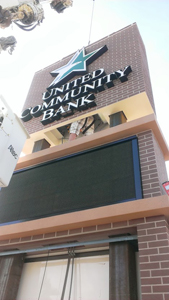
Sometimes sign shops can really push the boundaries of what they can produce by partnering with other manufacturers/fabricators. And a joint effort was just what it took when the United Community Bank needed a new sign.
After relocating its headquarters, the bank wanted an updated sign and contacted JH Signs & Designs of Perham, Minnesota, a company that has worked with the bank on previous projects.
The new location already had a single-pole sign onsite with an EMC and an illuminated tenant cabinet. The original plan was to retrofit the sign with United Community Bank’s branding, but JH Signs had other ideas.
“They added onto the bank and doubled the size of it, and I thought they should have a sign that matches that,” says Justin Helmke, president of JH Signs.
The sign shop submitted a sketch of a whole new sign that incorporated the bank’s name and logo in channel letters, a new illuminated tenant cabinet, the Daktronics EMC from the old sign, and a brick-and-moulding pattern that matched the new building.
The bank was sold as soon as it saw the sketch, and JH Signs got to work.
The biggest challenge was to find a way to incorporate brick on such a large sign. The cost to work with real brick didn’t make sense, so JH Signs turned to Signs by Benchmark, which the shop has worked with on previous projects, to create a faux-brick design.
Helmke contacted the architects of the bank building to get brick samples and measurements of the moulding radius and then sent them off to Benchmark. He also sent measurements of the cabinet, EMC, and channel letters. (Note: Pascual Signs fabricated the channel letters, which are lit with Samsung LEDs.)
When Benchmark received the measurements and the design, they made a few tweaks to the width of the bricks so that the pattern would be even throughout. They also made sure the design allowed for splitting the sign into multiple sections.
Benchmark fabricated the sign in five pieces: a base with a flat stone appearance, two U-shaped pieces to fit around the cabinet and EMC, the top faux-brick portion where the channel letters would be mounted, and the top moulding piece with a door for maintenance access. “The challenge was to make it look like a brick structure while allowing access into the heart of the sign for electrical hook up and maintenance,” says Helmke.
Since the sign was double-sided, there was no place on any of the sides for a door; so Benchmark and JH Signs decided to place the door in the very top of the sign, which Benchmark has used as a solution on other projects. “It takes a truck [to access it], but if you have to service a lighted sign, you generally need the truck anyway,” says Helmke.

Benchmark cut the five sign pieces out of expanded polystyrene (EPS) foam using a CNC router. With the measurements JH Signs provided, cutting proved a breeze. “All of our parts are computer-cut with the CNC, so it makes matching building elements pretty easy,” says Jamie Kakacek, Design and Estimating, Signs by Benchmark.
In fact, the biggest challenge was in making sure that the pieces lined up correctly, since Benchmark didn’t have the cabinet or EMC onsite.
Once all of the pieces were cut out, Benchmark added in pass throughs for the channel letter wiring. “Whenever possible, we like to make the pass throughs while we’re making the sign. It’s pretty much like a PVC sleeve,” says Kakacek. “It works out well for our customers too, because then they’re not having to drill anything onsite or in their shop.
“It makes it a little bit more user-friendly for [them].”
Next Benchmark coated all of the pieces in a polyurea hard coat to protect the EPS from the elements. The shop then started working on the faux-brick pattern that would match the sample JH Signs had sent. “We’ve kind of developed a system over the years to get a decent match for the brick,” says Kakacek. “Physical samples are always the best way of doing it whenever possible.”
Benchmark used stucco tinted with Benjamin Moore® and Sherwin-Williams® colors to create the brick pattern. “Then we did some handpainting on the bricks to get some of the shading right. If there’s any aging to the brick, a lot of that can be done with kind of a paintwash,” explains Kakacek. “We rely on our finishing team to get a lot of those elements to bring the whole thing to life.”
(Note: Tinted stucco was also used to create the flat stone pattern on the base.)
It took about six weeks for Benchmark to fabricate all the sign pieces. They then packed and drove the sign out to JH Signs on one of their own semi trucks.
With the sign pieces in-shop, JH Signs mounted the letters and logo to the appropriate sign piece and completed most of the wiring. Benchmark left the bottom of this particular sign piece hollow so that JH Signs had access to make the electrical connections.

Before installation day, JH Signs dug the footings for steel beams, set the beams in, and poured concrete for the base. They returned a week later and, using their bucket and crane trucks, slid all of the sign pieces over and down the steel beams.
They mounted both the new lighted tenant cabinet and the original EMC to the steel poles using brackets and then made the final electrical connections. “We basically welded on some angles and mounted everything to that,” explains Helmke.
It took three installers about ten hours to finish the install. The finished sign fit together perfectly and stands 143-1/4 inches wide-by-308 inches high-by-35-3/4-inch deep.
United Community Bank was very pleased with the final product and even happier with their decision to invest in a new sign.
By Ashley Bray
Photos (top to bottom): Signs by Benchmark, JH Signs & Designs, JH Signs & Designs.


