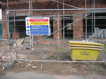
Workplace safety education has become a necessity for just about any industry doing business today. From fast food to deep sea welding, workplace hazards and injuries have the potential to leave employers legally and financially vulnerable.
Due to the prevalence of these potential safety issues, it is of the utmost importance that employers post clear and apparent signage detailing and warning against any possible safety risks around the workplace. These hazards can range from the very common (wet floor, live electrical current, etc.) to the most obscure (wild koala attack risk).
Thankfully there exist outlets where businesses can order both commonly displayed and custom-made safety signs. But when using a sign or label of your own design, it is important to remember that, first and foremost, the sign must get the attention of all employees in the area and that different situations will call for different types of signs.
Here are the most important things to remember when designing a safety sign for the workplace:
Shape. Different shapes of safety signs are nearly universally used to describe different situations and risks about the workplace.
A triangle shape is primarily used as a warning to give workers a reminder to remain alert due to the risks associated with a specific area.
A round sign on the other hand is meant to convey an area that is prohibited (such as a “do not enter” sign on a highway exit or entrance).
Lastly a rectangular sign is used to convey safety requirements for a certain area such as hard hat areas on construction sites.
When preparing to design your own safety sign, first identify what message the sign will be conveying to choose the appropriate shape for the specific situation.
Color. Like shape, color is also used to universally convey certain messages regardless of the language that the sign is actually printed in.
The color yellow is employed primarily as a warning message—yellow being one of the colors that the human eye notices more immediately than other shades it is ideal for the universal color to inform of a potential hazard.
The color red is used in safety signs to convey prohibition of a certain activity (such as “Do Not Enter” or “No Smoking”). Red is used due to receptors in the human eye being more sensitive to this hue than other colors in the spectrum. The color also travels the farthest and weakens least over distance.
Finally blue signs are employed to convey a mandatory message. This is why when you’ll often see “Hard Hat Area” signs colored blue. Blue is employed in these situations primarily due to the few negative connotations associated with the color.
Size/Placement. The last decision an employer must make relating to a sign for a specific situation is the actual size of the sign and where to actually post it. The most important thing to remember here is that the sign and language on the sign should be visible to any employee in the area regardless of quality of vision (or in some cases quality of attention span). Make sure a sign is large enough that the print can easily be read from anywhere in the area. The sign should also be posted at eye level and near the entrance to the area to ensure it is seen and its message heeded by anyone present.
In conclusion, different situations will call for different types of signs, but by following these simple guidelines, any business, regardless of industry, can help ensure a safe workplace for both employer and employee.
—Paul Meryln Thomas
Paul Thomas grew up with a long lineage of construction workers. Working as a construction manager for several years starting in his late 20s, Paul later was able to utilize his experience on the work site as a consultant for companies concerning safety issues in the work place throughout the Midwest. Paul has since then retired and now spends most of his days blogging on safety-related issues, building model airplanes, and spending quality time with his trusty parakeet (and partner in crime), Anthony.”


