Sometimes concepts are not quite as obvious as they may seem. For instance, tradition has dictated that the main identification sign be located at the entrance, parallel to the building façade. This is how we design.
But one of the most frustrating things that a sign designer has to deal with are community regulations that are strict about sign size and placement; this can result in signage that’s often overlooked or just quickly driven past.
Similarly a sign that’s positioned to the building can also be visually passed over by a viewer. And viewed off-center, thick dimensional letters blur together, especially if the returns are the same color as the face.
However there is a different “angle” to solving this problem—that is, angling the placement of the sign. Here are some successful examples:
Photo 1: Broadway and 7th Avenue in New York City has always put an angle on a sign to tilt it towards the viewer. After all, pedestrians are the most-targeted audience in Times Square.

On the vertical, the signs are installed with a dedicated view—headed north or headed south. In-between the street corners, the signs tilt down towards the sidewalk.
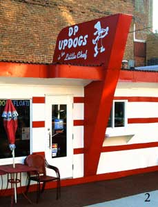
Photo 2: Then again, the concept of an angled sign doesn’t necessarily have anything to do with the viewer logic intended for Times Square. An angled sign might simply work in order to get the graphic away from any obstruction the architecture might be causing.

The color scheme of the building may be a big plus in identifying the establishment, long before the sign is readable. But when a sign is triangled with the lead edge towards the street, the faces of it can be seen as the driver is approaching.
Photo 3: This twin-face, full-triangle cabinet serves the viewer as a better attraction device and, with a few installed down lights, serves the proprietor with flooding nighttime illumination.
(Note: The little add-ons here are fun to decipher. Take the descending “$” on its bottom as a leading point, for example. Was this always a dollar sign? Or was it a logo that became obsolete? After all, does the portrait of Mr. Franklin not already communicate the idea behind this sign sufficiently?)

Photo 4: Here’s a sign that also doubles as the façade, but the name of the restaurant doesn’t conjure up an image of the cuisine. Instead the flat applied vinyl tag line, angled towards the viewer below, clues one into the delights found inside.
The design may have been as much about the architecture as it is about the signage. The neighborhood appears to be competing for your taste buds.

The main letters are notched-out with white returns. The angle is to catch the eye of the viewer below, while the tag line makes for a readable sign at angles to the far left and far right.
Photo 5: There are several additional details that make this an interesting angled sign. For starters, it features no perimeter frame. It looks as though the face is not even attached to the cabinet.
The bottom edge has a gentle wave and the wash of light down from the sign is a free plus in the design. The cabinet provides the angled view as a function of its design.

Barely visible in this photo is its well-known logo. It’s angled 90-degrees to the wall. A simple logo may also be a requirement for such a mount. One can only assume that the entire assembly is supposed to be the sign.
Photo 6: The 1950s aircraft motif, with the “nice mounts” cable support, make this a complex item. The letters themselves aren’t anything special—it’s that they’re mounted to the top and angled that makes all the difference in the world here. The rivets are a nice touch too.
Photo 7: In this case, the location definitely had the client “in a corner.”

Yes it’s possible to use a low-tech method to angle a sign. The letters look as though they should be flat on the facade in a single file line, but the surfboard is a backer.
This example is an ingenious way to fabricate the sign. The black box behind tells the story: “We need a better view for our sign.” Simple and effective.
By Peter Perszyk


