

 Vancouver’s Chinatown is experiencing quite a resurgence nowadays, as the area simultaneously embraces its history while adopting modern-touch flourishes and improvements.
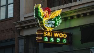
For example, a brand-new recreation of a once-glowing neon rooster sign is again brightening the neighborhood thanks to a recent installation that marries one restaurant’s rich history with a shinier future.
And the return to its perch is a sign story for the ages.
The Challenge
Located in Chinatown’s East Pender district, Sai Woo Restaurant re-opened in 2015. The establishment was named after the original restaurant that served as a chop suey house in 1925 before its closing in 1959.
Today Sai Woo thrives as a local favorite, operating out of the exact-same building in the historic neighborhood.
The original neon rooster sign identified Sai Woo from the late 1930s up until its closing. But since its removal, the sign has been lost to the passages of time.
Current owner Salli Pateman had been using a large awning and painted lettering on the exterior of her restaurant and had no idea that this neon sign ever existed. But after someone shared with her a grainy YouTube clip of a 1958 Chinatown parade that featured a brief glimpse of the lit sign, Pateman was determined to find it, restore it, and return it to her restaurant’s exterior. However her inquiries with local archives and sign shops yielded nothing on its whereabouts.
In fact, the only evidence of its existence that she had was in the one frame from this video clip. It was going to take a lot of work for this neon rooster to rise phoenix-style from the ashes.
Pateman teamed up with TDH Experiential Fabricators of Surrey, British Columbia to bring this piece of history back to Vancouver’s Chinatown in a brand-new construction.
Although the company considers themselves a sign shop, TDH also identifies as a custom fabrication shop that specializes in lighting. “We tend to specialize more in artistic-style retro signs and the hard-to-build displays that utilize creative fabrication techniques,” says Troy Hibbs, managing partner at TDH.
During initial discussions with TDH, Pateman learned that it was going to cost $18,712 to recreate the neon rooster, which put the brakes on its resurrection. She remained passionate about this project, so employing a twenty-first century strategy, she launched the Kickstarter campaign “Bright Lights, Van City” to raise funds to bring this sign back to life—and she succeeded!
“This was the first time that we had experienced waiting for a Kickstarter campaign to conclude before getting the go-ahead to start work on a project,” says Troy. “It was…unique.”
The goal was to make the new Sai Woo rooster sign look exactly like it had never left its original location.
TDH grabbed a screenshot of the rooster sign from the YouTube video and studied the layout, style, and techniques used on the original sign. “The clip was not HD-quality,” says Troy. “In fact, it was very grainy.”
So they imported the screenshot into Adobe Illustrator and handcrafted the sign the best they could from there.
The Build
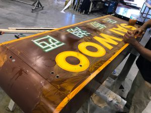
The all-steel sign cabinet features an angle frame inside it. “After building this cabinet, we started hand-forming the steel rooster and outer shape to fit the look of it,” says Troy.
The company had to approach this project as a history lesson. While TDH knew the overall shape of the sign, they didn’t know its exact colors (although they had a vague idea). “We studied the other signs in that area that would’ve been in Chinatown Vancouver back then,” says Troy. “We then looked at the different features and finishes that would’ve been used.”
TDH also applied different aging processes to dull it down, which involved the team going through a discovery phase. “There’s no one-size-fits-all way that a sign ages, and we didn’t know its repair or service history,” says Troy. “So we approached it as an artistic application [using] our own interpretation.
“We like to tell a story with each aging process we added to the sign.”
They began by using Matthews Paint Systems for the base colors of the sign, and then they painted and airbrushed the lettering and some of the finer gradient colors. “Once we started hand-brushing the lettering, it immediately started looking like an older sign,” says Troy. “We also wet-sanded the paint in order to make it look faded, as if it had been sitting in the sun for many years.
“We also added fake rust spots where water might have pooled or dripped consistently over time and thought about any possible burn marks or arcing neon. We also banged up the sign a bit, imagining a bucket truck hitting the sign while servicing it.”
TDH Experiential had final choice for the sign’s neon colors. In addition to the brief video clip, the Sai Woo owner provided them with some articles about the sign around that time, as well as a faded original menu featuring the rooster to help them better gauge the appropriate colors. “We also considered if the sign had been sitting in the sun for sixty years, how the colors would age,” says Troy.
 They settled on Clear Gold, Green, Red, and White 12mm-diamater glass tubes. The end result is a bit softer colors than the original but still close. “I’m sure the original had some different shades in it,” says Troy.
The neon tubes were shaped by Troy’s younger brother, Andrew, who at age thirty-one is Vancouver’s youngest recognized neon bender. Troy and his brother grew up in the sign business, as their father was an original neon master. (Note: Andrew started bending when he was fifteen years old.) “We were always surrounded by neon growing up. We would be out there repairing neon before and after school,” says Troy.
They attached the neon to the sign shape using glass tube supports that were riveted into place. “The neon sits in the grove of the glass support and is tied off with wire,” says Troy.
The amount of neon used on this sign is tremendous for its size—34 units averaging around eight linear feet per unit (approximately 275 feet of neon). It also features six transformers inside of it. “We had to take into account that the internal structure needed to be able to be serviceable in the future,” says Troy. “We also had to make sure all the wires were properly separated from each other and that the transformers were in safe positions.”
Since the 6-foot-tall neon rooster sign weighed 600 pounds, they used a crane to lift it into place onto the restaurant exterior. “We were very selective on where to place the strapping, so there would be no chance of pinching or hitting the neon, as the straps started to flex,” explains Troy.
The sign features a plate on the outside that’s welded to the main structure and a plate on the inside that sandwiches it between the wall. They bolted it through the wall using 3/4-inch threaded rods and added four lines of 3/8-inch aircraft cable running up the upper side of the building to help spread some of the weight load on it.
The Reaction
This project was accomplished thanks to a team effort and pre-planning meetings between Troy, his brother, the designer, and the two main fabricators, as well as the sketching of full-size patterns.
“My brother pointed out where he needed electrodes and lead wires placed, and they had to consider how the steel work and internal frame would affect the neon placement,” says Troy.
Troy says the restaurant owner’s interest in Chinatown and her passion for her business and building made this experience enjoyable. In fact, she was in tears during the final installation. “To see a customer being that excited about a sign coming to life was cool,” he says.
By Jeff Wooten with additional reporting by Sandra Shechter.
All photos: TDH Experiential Fabricators.


