

We’ve all had to deal with a product advertised as “one size fits all.” Usually we find, when it’s too late to get our money back, that it doesn’t. The same holds true for ADA.
When the federal government wrote the very first rules for accessible signs, they figured they would make it easy on everyone by just having one size for room identification signs—one size for people who couldn’t see different colors very well, one size for older people with diminishing clarity of vision, one size for people who couldn’t see much of anything (maybe a sliver of light), and one size for people who could actually make out some letters on some signs (depending!).
And then, they threw in that same size for signs to direct people around buildings and to give them information about what they could or could not do in those buildings and about how to use various parts of the buildings.
Of course, we’re not just talking about size, although that is what is most at stake. Sometimes we’re talking about the darkness and lightness of the letters and background, and sometimes it’s about how shiny the surfaces are. Sometimes, too, it’s about where the signs are mounted—high above your head or maybe just a few feet above the floorboards.
Now that I have you thoroughly confused about the rules for ADA signs, let me unravel it a bit and then give you the good news. There is a solution—it’s legal, and it will help you offer really interesting and unique ADA-compliant signs to your customers.
First, let’s talk about the original set of rules, called ADAAG. They were pretty simple.
You had two choices. Room- and floor-level identification signs all had to be readable by touch, with raised characters and Braille. And they had to do dual duty for those who could see; so the characters had to contrast with the background, and all the surfaces had to be non-glare.
The only rule for the Braille was that it had to be “shorthand Braille,” otherwise known as Contracted or Grade 2 Braille. Outside of California, which had its own Braille font, there were no rules for the size of the dots or the spacing between the dots or the Braille cells.
As for the letters, here’s where the mix-up came in.
Visual-only text was supposed to allow “simple” types of serif fonts—meaning non-decorative serif fonts. Tactile text was supposed to be sans serif.
But somehow, some of the rules got switched. The “simple serif” was born, and thousands of unreadable tactile signs were the result.
On top of that, the strict rules about stroke widths and character widths meant tactile characters got added to visual characters instead, and other than the requirement for ALL CAPS, most of the important rules for tactile characters were lost.
Tactile character size was 5/8-inch minimum and two inches maximum. The only size mentioned for visual characters was a three-inch minimum for signs mounted eighty inches above the floor.
But the result was that architects specified every single sign with 5/8-inch-high characters unless it was 80 inches above the floor, and then all the letters were three inches high—a ridiculous jump from 5/8 to three inches! But most signs were 5/8 inches. How many of you can read a directional sign with 5/8-inch-high characters across a room?
Way back in about 1996, President Bill Clinton convened a committee to update the ADA Standards—and they obviously needed it. Those of us on the working subcommittees set about correcting mistakes and adding some of the things that had been overlooked. We got rid of “simple serifs” for tactile characters and added in stroke and character width requirements.
However we were afraid to change too much. We thought it might cause a mutiny, since people were just getting used to the rules.
 Everything was ready to go, and public hearings and comments were all in place. However the 2000 election changed the plans, and the new standards languished until 2012. The new rules were finally approved and made legal during the Obama administration.
The best thing about the new standards, called the 2010 ADA Standards for Accessible Design, is that “one size fits all” disappears, if you know where to find the right rules. The problem is—most people don’t! It is the best-kept ADA sign secret out there, although it’s hidden right in plain sight.
As we talked with many legally blind people, it became clear that they fell into two distinct groups—and those two groups needed completely different signs.
One group couldn’t see much at all, and they had to read by touch. A small percentage could read Braille, so the rest needed to have tactile characters that were really easy to read. What they didn’t need was contrast or non-glare surfaces, since those only affect people who can see.
We noticed that they preferred to read rounded or beveled and very thin character strokes. Renowned designer Roger Whitehouse, who was designing a system for the Lighthouse for the Blind in New York City, described the preferred fonts as “wire hanger shapes.” They needed a lot of space between letters, as well, and they liked fairly small-sized characters, so they could feel them all at once (just like Braille) rather than trace them. Those letters weren’t very pretty, so Roger asked himself, “Did sighted people need to see them?
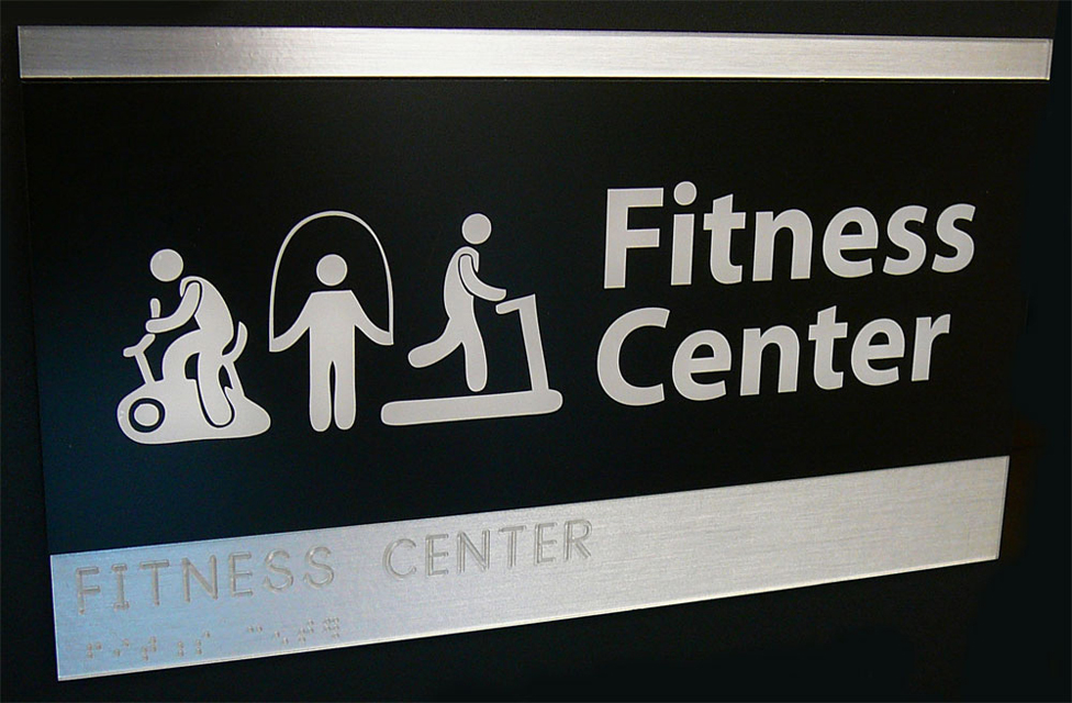
With that question, the dual-purpose sign was born!
 Roger designed the new signs for the Lighthouse with two parts. The tactile section was hidden in a decorative part of the sign and the visual part used much larger, bolder characters. The most important thing was that they had really high contrast with their backgrounds and were non-glare.
Besides that, the signs could use upper and lower case, and non-decorative serif styles. That made them easier for more visual users to read—and often more attractive, to boot.
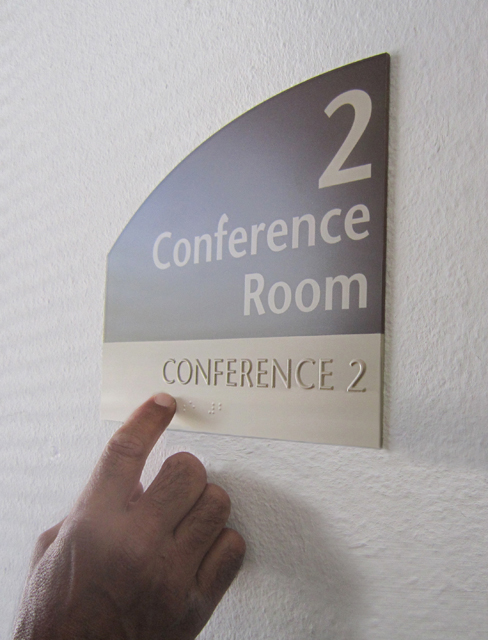
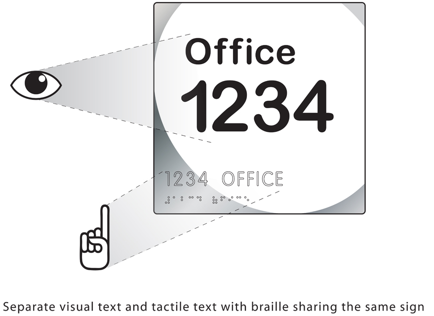
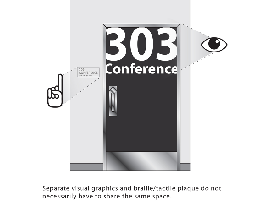
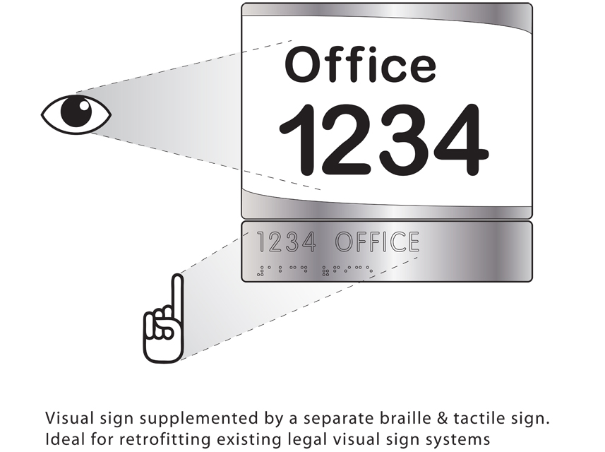 You might think that the two parts all have to be on one sign blank. However, the rule is clear. The characters can be on one sign blank or separated on two signs.
It’s too bad that the government speak used for the ADA Standards is pretty opaque. If you don’t already know this new rule, you might never discover it.
The ANSI Standards are actually written so that it is much easier to understand. However if you can unravel the legalese, you’ll see that visual characters have specific rules for font style and character and stroke width as well as minimum character heights, but more importantly, they require high contrast between the characters and their backgrounds, along with non-glare finishes.
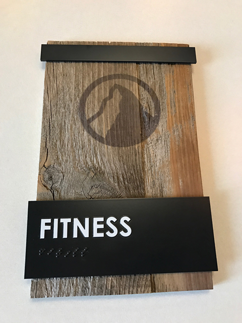
On the other hand, tactile characters have even more stringent rules for fonts and sizes but no rules at all for contrast or glare. It means repeating the same message twice, but one of those messages can do dual duty as a decorative part of the sign or it can be virtually hidden by having the sign background match the wall covering.
Creative sign designers should be having a field day with this rule, and owners who want to solve problems or save money may also find a solution here.
 For instance, the designer for a very high-end hotel with individual hideaways on paths wending through the grounds wanted visual signs mounted on rustic posts, planted among flowers at each entrance. The doors had glass side-lights. The matching tactile room numbers with Braille are thermoformed on clear acrylic, which is treated to look like the polished glass of the side-lights, and crystal-clear adhesive means the sign looks like part of the glass.
On the other end of the economic spectrum, let’s say a school already has easy-to-read visual numbers stenciled on each classroom door. A small plaque with raised numbers and Braille can be painted all one color to match the wall and mounted adjacent to the door. A hotel with high-contrast brass numerals on the doors just needs to add an unobtrusive tactile sign on the wall.
 Not only are people with disabilities not being short-changed by these signs, but it means far more people with vision-based disabilities can actually read the signs. It also means that we no longer have to accept white-on-blue uppercase Helvetica as a kind of de facto ADA standard.
The ADA asks: How can we make our public buildings more usable by the greatest number of people of all ages and abilities? We think the answer lies in many more beautiful two-part, dual-purpose signs.
—Sharon Toji
In 1991, Sharon Toji, who has a life-long interest in disability as well as a background in U. S. documents and who had joined her husband’s sign company to work with design and code issues, heard that the upcoming Americans With Disabilities Act was going to impact sign design and fabrication. She called the U.S. Access Board to find out more, and started a more than twenty-five-year-long dialogue with the staff there.
In 1992, the International Sign Association, originally NESA, asked her to represent them in their application to join the American National Standards Institute (ANSI) Committee on Accessible and Usable Buildings and Sites. Ms Toji is still a voting delegate, and is currently the long time representative of the Hearing Loss Association of America, although she is considered by many to be the major resource on the Committee on the entire topic of accessible communications issues of all types.
 During her career, she has also been a prominent voice in the State of California, as a member of the long-time State Architects Access Committee, an ad hoc committee for the State Fire Marshal, and a three-term member of the Access Advisory Committee of the State Building Standards Commission. She was also on the team hired by the State of California to bring the California Building Standard into compliance with the 2010 ADA Standards for Accessible Design. In 2013, The California Council of the AIA awarded her with a Presidential Citation for her long service to design professionals and to the public at large on the topic of public access.
Those who are interested in her services, which include her manual, Signs and the ADA, as well as surveys, complete sign program designs, inspection aids and seminars can visit her Web site, AccessCommConsulting.com. She also has a LinkedIn group called “ADA Sign Lady” for those interested in the latest news and discussion about accessible communications.
At eighty-two, you can still find Sharon at her desk every day, answering questions posed to her by sign companies, inspectors, designers, and architects from all over the country.


