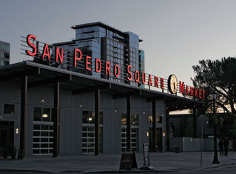
 The recently opened San Pedro Square Market is a mix of new construction and redevelopment located in downtown San Jose, California (in the heart of Silicon Valley). The complex houses older and newer restaurants, bars, and a farmer’s market.
Its owner had spent years working on this urban marketplace, and toward the end of the development process, he recognized the need for iconic identity signage. Taking visual inspiration from the famous signage at the legendary Pike Place Market in Seattle, he wanted a sign marriage of modern with retro.
Enter Pacific Neon Company, a full-service, third-generation sign company in Sacramento, California. They became involved when one of their clients told the San Pedro Square Market owner about their dynamic work. (Note: Pacific Neon was also involved in “A Towering Illuminated Pylon Sign,” May 2012)
Here the owner specifically wanted the “look” that neon offers.
“He was looking for a throwback to the era of marketplaces and was attracted to the energy and vibrancy that exposed neon creates,” says Ralph Cundiff, Jr., vice president of Pacific Neon.
The first challenge: Sifting through all the ideas the customer had. Thanks to Google, the property owner visited Pacific Neon and brought along numerous examples of similar-type neon signs from the 1930s, 1940s, and 1950s.
“The Internet can be a wonderful research tool at one’s disposal,” says Cundiff, “but sometimes you can find so many examples that it can be overwhelming.
“But our designer was able to take in all the examples and execute them in a contemporary, yet nostalgic design.”
Channel Letters
Pacific Neon designed and built open-face channel letters with four tubes of exposed red skeleton neon. These letters would be attached to one of the roofs on the new building.
The design process involved lots of back-and-forth interaction with the property owner and included various signage prototypes, design layouts, and neon color combinations. Despite Cundiff’s suggestions for a multi-color neon appearance, the client ultimately decided on red because, well, the aforementioned Pike Place Market signage was red.
The tallest channel letters (the first letters of each word—“S,” “P,” and “M”) are 5-½ feet tall, while the remaining letters are 4-¼ feet tall.
After finishing the channel letters, Pacific Neon then fabricated a retro-style gridwork frame and mechanically bolted the letters to clips welded to the frame. The channel letters and frame were pre-assembled in sections at Pacific Neon’s production facility.
“We used our crane to lift [everything] into place,” explains Cundiff.
Illuminated Clock
Since Pike Place Market uses a clock with its signage, Pacific Neon also set up an internally illuminated clock to accompany the red-glow channel letters. This clock measures a little over eight feet in diameter and, because of its shape and size, features fluorescent lighting.
Pacific Neon didn’t build this clock; they purchased it instead.
“You don’t reinvent the wheel,” laughs Cundiff. “This would’ve been our first-and-only time of actually building a clock, so we opted to go to someone who makes clocks on a regular basis.”
Blade Sign
Meanwhile the owner had also retained the outer shell of another adjacent building and gutted its interior for development. For this particular location (and to aim for another days-gone-by design), Pacific Neon designed, constructed, and installed a 16-foot-tall-by-5-foot-wide neon-illuminated blade sign.
 The company designed the blade sign turnkey from start to finish (originating about four different concepts for it).
“The owner was very enthusiastic as we walked him through our design and prototyping processes,” says Cundiff. “He developed a lot of confidence in our abilities and in our understanding of his vision for this project.”
The white, acrylic-faced “San Pedro Square” letters at the top are internally illuminated with white neon, while the descending “Market” letters are backlit with white neon. Red neon is used as a border throughout. Green skeleton neon makes up the arrow on the sign, while yellow skeleton neon forms its tip.
Pacific Neon also designed and built the framework that anchors this sign to the parapet and rooftop of the building.
An Enlightening Reaction
One extra-special aspect of this project for Cundiff was that this customer wasn’t a client used to buying signs on a regular basis. This meant he was still “fresh” about the sign-buying process.
“We put up a sign, and thirty minutes later, he’s calling to tell us how thrilled he is with it,” says Cundiff. “That was rewarding for us as a company (and as a salesperson) to get that immediate reaction and feedback from a client.”
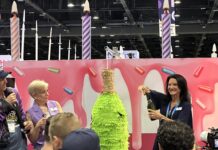
The owner was so excited that he even held an official sign lighting ceremony at the Market attended by 200-plus people. The event even included a self-made, six-foot-tall light switch mock-up and a countdown display.
“It’s a lot of fun to do work with customers who have that type of enthusiasm and appreciation for your work,” says Cundiff.
This ceremony even generated media coverage. Thanks to it, a prospective client called to ask if Pacific Neon could possibly do signage with a ceremony for them—having no idea of Pacific Neon’s involvement in this project.
“You could imagine my pride when I told him that we did that sign,” says Cundiff. “It was a beautiful completion of the circle.”
—Jeff Wooten
Photos courtesy of Pacific Neon Company & San Pedro Square Properties.


