
The new Robinson Community Learning Center (RCLC) in South Bend, Indiana, has been an ongoing program in the community for twenty years now providing educational classes, enrichment programs, and even theater activities for all ages. The RCLC is an off-campus educational initiative that’s a part of nearby University of Notre Dame and is also a celebration of the people in the area.
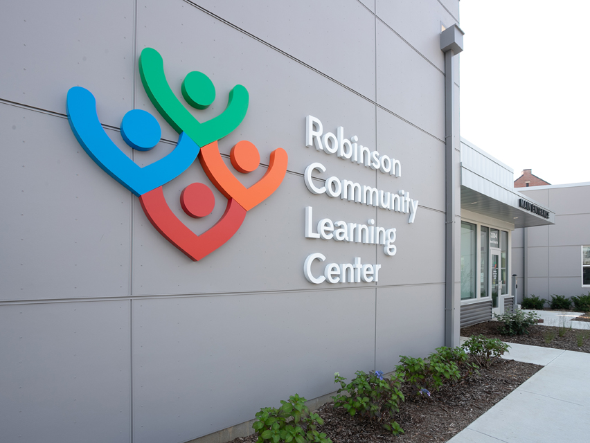
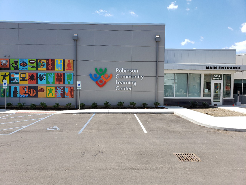
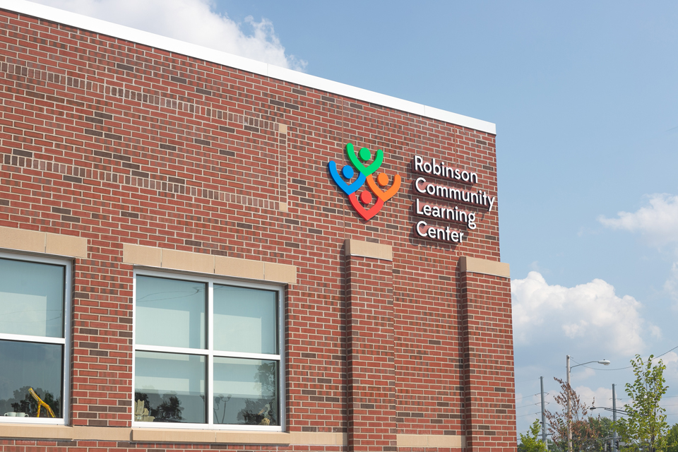
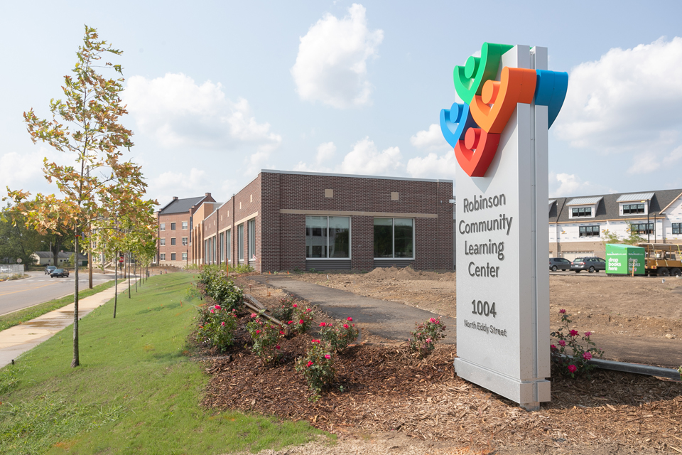
The RCLC recently moved one block north to a newly built facility. It also brought along a new logo and branding featuring colorful abstract figures raising their hands together that was developed by the University of Notre Dame’s Marketing and Communications department.
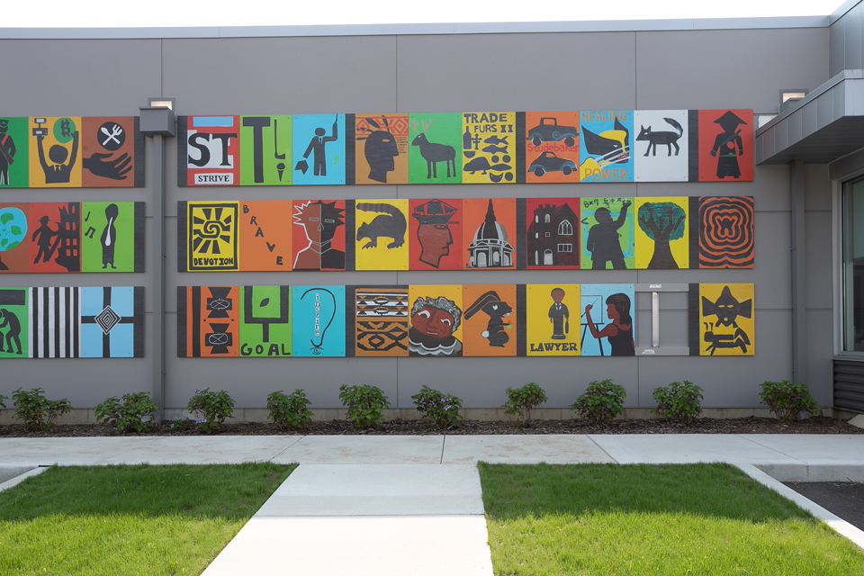
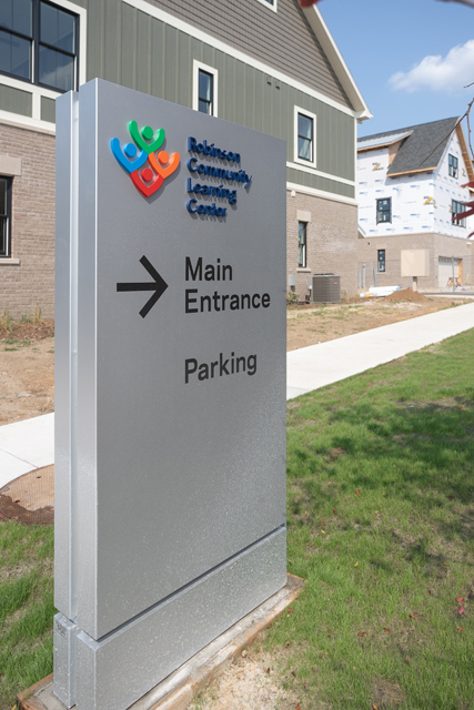
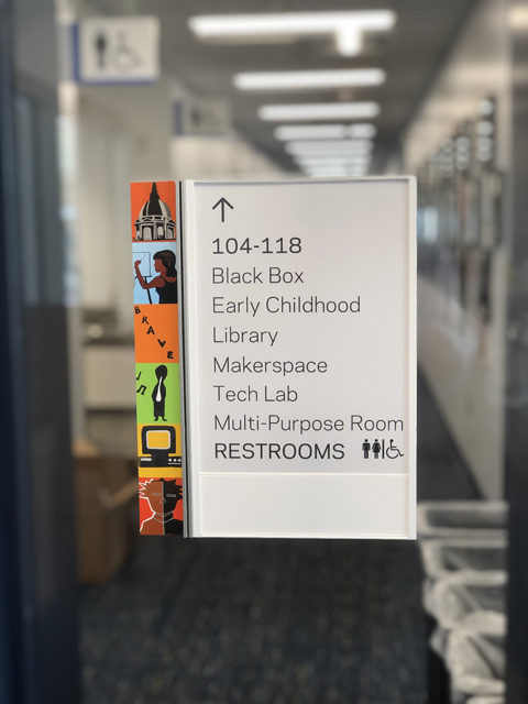
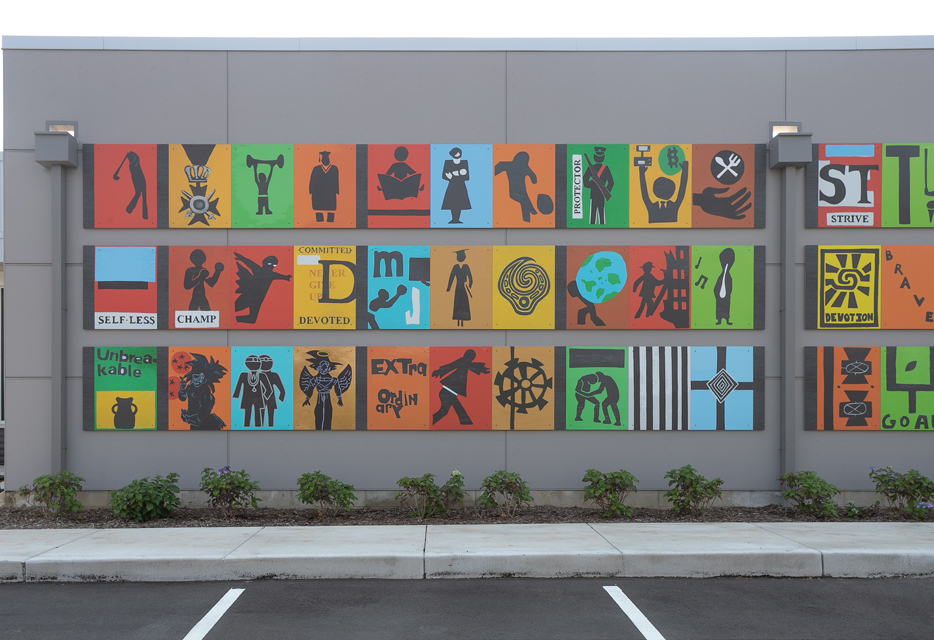
The new learning center includes identification site signs at its corners as well as a wayfinding directional on the property. The main building sports sets of letters-and-logo on its exterior, as well as an attention-grabbing, grid-like artistic mural. Inside colorful branding is present throughout, and artwork from the mural has been incorporated into the ADA, wayfinding, and room identification signage.
The company responsible for designing these signs, as well as selecting its various fabricators, was Cardosi Kiper Design Group, a communications design firm based in Chicago, Illinois that develops wayfinding systems, branding programs, and theming and experiential graphics. “Our main markets include higher education and healthcare,” says Ted Kiper of Cardosi Kiper (which he co-founded with his partner Kim Cardosi).
Kiper says that their firm is in the business of “building relationships” with their clients. “You always start on the first project by getting to know one another and hopefully bring the project in on budget and on time,” he says. “Then after the second and third projects, there’s a ‘trust factor’ established.”
One of the clients they’ve built a trusting relationship with over fifteen years now has been the University of Notre Dame, which led to the RCLC project. The firm has worked on close to 150 on-campus projects for the university. Most have been academic-related, yet they have expanded to tackle athletics as well. For example, they completed a stadium enhancement at Notre Dame Stadium, which was also recognized by the Society of Experiential Graphic Design in their annual design competition.
The Outdoor Mural
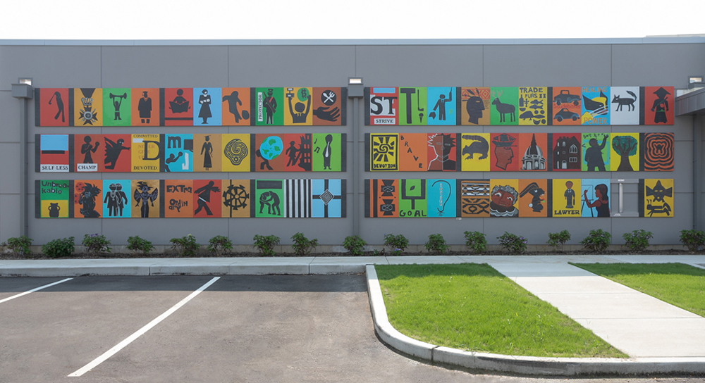
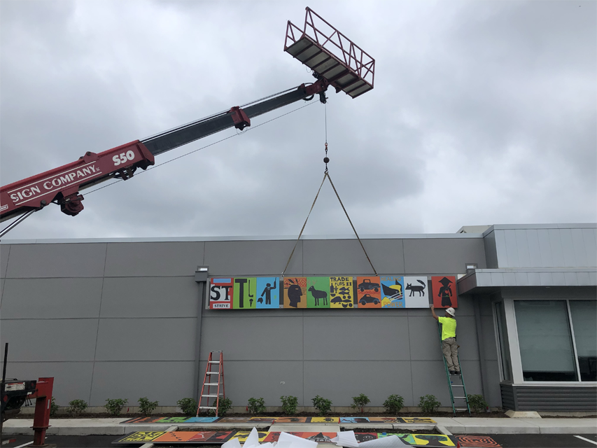
The new, grid-inspired mural is actually a reproduction of the themed artwork mounted outside the old Robinson Community Learning Center building. Locals have long recognized the mural as the most identifiable feature on its façade.
Its creation was led by artist Bernard Williams, which saw him working with multiple classes of RCLC students to create artwork for each individual panel that would reflect a “thematic story of each of the students’ learning journey.”
“Anytime you get to work with a fun, colorful brand and reproduce something that children have made, it’s not only rewarding for you professionally but also for your spirit, making you feel that you’re giving back a little bit too,” says Kiper.
The original artwork was individually painted onto MDO marine-grade plywood panels. Over the years, moisture affected the surface of this material and caused it to warp. Add in the fact that the original paint colors were fading due to exposure to the elements, and this made it apparent early on to Cardosi Kiper that they wouldn’t be able to simply transport these panels over to the new building.
Kiper made the decision to digitally reproduce each panel, bringing them back to their original color. The designers also provided a texture to replicate the appearance of the original wood panels onto a new, weather-resistant substrate.
His firm researched the University of Notre Dame’s Archives Department and discovered the original artwork and colors for the mural. They reimaged each panel’s artwork as a vector file in Adobe® Illustrator® and sent them to iZone Imaging of Temple, Texas to reproduce using a high-pressure laminate (HPL) process that would fuse the panels within an impenetrable melamine surface. “Their HPL material was going to be able to withstand the test of time with the sun and varied climates. It will hold the color well too,” says Kiper, noting his firm has worked with iZone for twenty years now starting with a successful trailways sign project.
Interestingly, due to the size of the new RCLC building and its façade, the mural panel reproductions are actually slightly reduced from their original size. “Working with the architects early on, we calculated that the panels would need to be reduced in size by 5 to 10 percent from the originals,” says Kiper.
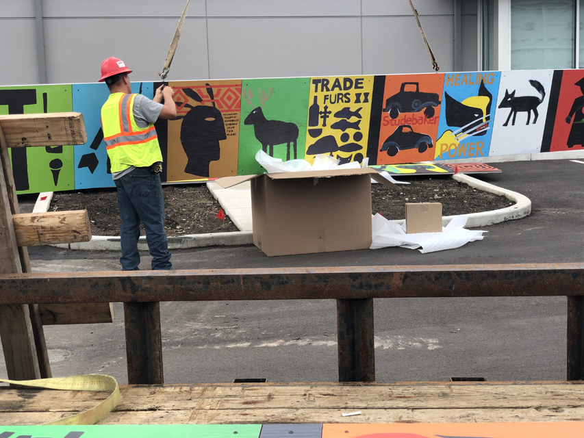
Cardosi Kiper chose Valley City Sign of Comstock Park, Michigan to handle all the exterior installations (along with RWL Sign Company of Kalamazoo, Michigan). Eighty-four panels were directly shipped from iZone to Valley City Sign, and they created an aluminum rail system to place behind the panels. They fastened the panels in through the face using non-corrosive screws and bolted them to the wall.
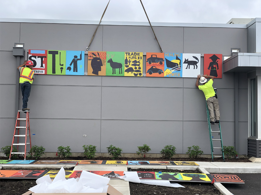
Next Valley City Sign placed a weather-resistant caulking behind the channels to avoid any water accumulating on the rails. “It was actually a square, hollowed tube channel, which prevented moisture from sitting in a U- or L-channel,” says Kiper. “Then they mechanically fastened those back channels into the wall and then mechanically fastened the front panels into the front side of that channel. They then used their Elliott crane truck to lift the panels up in sections and install them onto the building.”
Letters and Logo
Valley City Sign fabricated one set of non-illuminated channel letters-and-logo, a custom-illuminated monument sign, a set of “main entrance” non-illuminated channel letters, and an on-property directional sign.
The face-lit Robinson Community Learning Center lettering and logo found on the southwest side of the building measured nearly 100 inches wide-by-36 inches tall. These were produced by Provis Graphic, LLC, a wholesale manufacturer of low-profile, trimless, LED-illuminated letters and logos with U.S. headquarters in Minneapolis, Minnesota.
These letters and logo elements were manufactured on Provis Graphic’s LaserLetter™ | Profile 11 translucent cast block acrylic platform with individually embedded LEDs. “The Profile 11 letterform platform features a crisp quality of light diffusion within a low-profile, face-lit form factor (30mm or 1-1/8-inch-deep or less) where small face-letters or narrow font stroke and/or letter serif design requirements limit the possibilities of traditional channel letters,” says Kenan Hanhan, president and co-founder of Provis Graphic, LLC. “The LEDs are completely sealed and protected from the environment with an IP 68 rating.”
Kiper has known Hanhan since they both worked together on the aforementioned Notre Dame Stadium project. During the specifying process, Kiper knew the letters were going to need a very crisp look. “Typically when we do front channel letters, we don’t like that traditional kind of trim cap around the faces of the letters,” he says. “We wanted something like an acrylic face seated into the channel letter so that there’s no kind of trim on the face of it. The Provis letters allowed us to achieve that.”
The custom, illuminated letters are attached to a raceway Valley City Sign built and mounted to the brick wall. Provis Graphic supplied mounting patterns printed on Blueback paper and mounting hardware (typically M4 threaded studs) with the signs. “While our partners’ signs are in production, we e-mail digital mounting patterns and electrical diagrams, so if they wish, they can begin pre-drilling and pre-wiring while the signs are in production,” says Hanhan.
An interesting element here is the translucent vinyl used for the exterior daytime and nighttime-illuminated signs that help maintain the bright branding colors. Provis Graphic supplied this vinyl, manufactured by Oracal® in Europe, to Valley City Sign to make the rainbow of colors on the outstretched arms of the title characters stand out even more when they’re illuminated.
Branding and Interior Signage
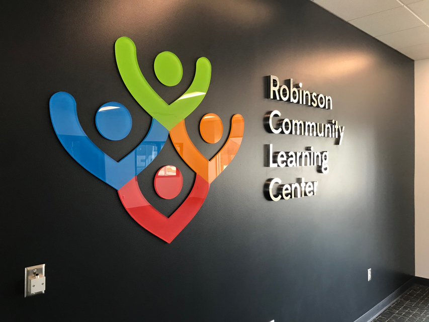
Primary colors play a large part in the RCLC’s new branding. These bright hues can be found in the outdoor logo mark, the mural art, and the directional, as well as the new building’s interior.
Kiper turned to a couple of architectural and wayfinding specialists for the interior work. Boardwalk Design, Inc., a part of Icon Sign Company, out of Grand Rapids, Michigan, handled the branding and artwork. The company works on large and small theming, signage, and branding projects for clients throughout Illinois, Indiana, and Michigan. Here they provided the entrance sign, which consisted of polished stainless steel can letters and second-surface painted acrylic.
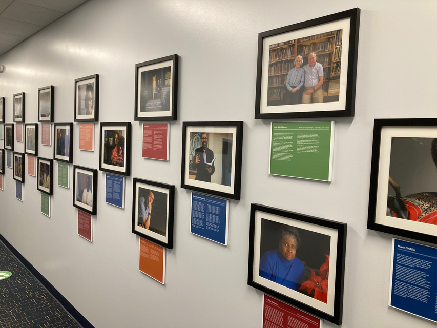
Boardwalk Design also hung several art pieces provided by RCLC officials, as well as matted and framed photos related to the Learning Center and installed them alongside descriptor panels.
Meanwhile APCO Signs of Atlanta, Georgia handled the interior signage program. (Note: Kiper has frequently called on APCO Signs for other projects, including prior work for the University of Notre Dame.)
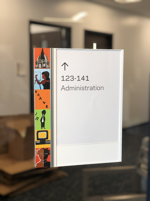
The outdoor mural art even found its way inside. Cardosi Kiper designed the interior signs to be a little bit more playful and complement the bright primary color branding. So they shrunk the mural artwork files down even more and infused them into the side panels of the interior wayfinding and room identifiers throughout the new building.
“The goal was to tie the visual message from the outside to the inside by using the mural artwork,” says Ken Mettler, regional sales manager at APCO Signs. “At each door and wayfinding sign, the visitor is reminded of the artwork and community that has helped create this wonderful space.”
APCO Signs installed a total of fifty interior signs onto painted drywall and glass throughout the learning center: Thirty-eight room ID signs (fifteen on glass), two projecting wall mount (PWM) signs, two directional signs (one on glass), and one evacuation map holder. “All but the two PWM signs were installed at standing height,” says Mettler. “Those signs were installed with 3M V2862H double-sided tape and GE clear silicone adhesive.”
The company installed the two PWM signs by using a six-foot ladder and anchoring them to the wall using two #10-24 X 3-inch toggle bolts per sign.
The glass-mounted signs were installed on top of a piece of matte-white, pressure-sensitive vinyl that APCO Signs cut to match the overall size of the sign it was being used with.
“Instead of placing the vinyl on the room side of the glass, we decided to install the vinyl to the corridor side of the glass and [place] the sign on top on it,” says Mettler. “We feel that the 3M tape adheres better to the vinyl than it does to glass.”
Project Management
Kiper says that bringing different companies with different fabrication techniques onboard to work on single projects such as this comes down to pinpointing what the firms specialize in and what is appropriate for the client’s budget. “Very rarely do we sit down and just say, ‘Everything is going to be built by ‘X!’” he says. “We treat it like how a building is built. There are a lot of trades that go into its construction, and that’s very similar to the sign fabrication process.”
In the early stages, Cardosi Kiper breaks projects like this down into phases.
The first phase is programming, which involves fact-finding and laying out the ground rules. Then they go through two pretty solid design phases—schematic design and design development. “In schematic, we’re coming up with initial design options. Then, in design development, we’re refining the selected option and playing that out in the full complete system,” says Kiper.
Next they draw up construction documents where they detail and dimension every single nut and bolt on the sign and send that out to bid. Once awarded, they meet with the fabricator, review shop drawings and material samples, and then oversee installation.
Cardosi Kiper worked early on with the municipality to obtain approvals where the signs were sited, as well as a community development right along one of the side streets that had their own sign policies. He finds it beneficial to get this taken care of early in the design process. “We find that if you sit down with municipalities and review with them what we’re thinking about before sending over the drawings, often times they’re going to be more receptive to providing a variance or permit,” says Kiper. “That’s always helped us.”
—Jeff Wooten


