
By Ashley Bray
With more and more customers conducting business online, banking, like so many other industries, has undergone many changes over the last few years.
To stay relevant and useful to customers, banks have redesigned and repurposed their brick-and-mortar locations into community hubs.
FCBank’s branch in Bucyrus, Ohio, wanted to make such a change through its branding and aesthetics. The branch hadn’t updated its interior or exterior in decades, so it was overdue for a makeover.
One of the big things the bank wanted to focus its redesign on was its “cardinal rules,” which describe the bank’s values, what it is to the community, and what it offers to customers.
In order to make this community-focused redesign a reality, FCBank President Jenny Saunders turned to American Sign Studio of Columbus, Ohio, who she had previously worked with on a holiday window graphics project in the community.
American Sign Studio, which is a design-driven company, jumped at the opportunity to help transform FCBank.
President Margie Hegg started American Sign Studio three years ago when she was looking for a new career path after being laid off from her job in fashion. The full-service, women-owned sign company is a member of the Signworld network, which provides sign business start-up solutions with a no-royalty structure.
Design Deposit
For the FCBank project, Hegg started by talking with the bank about its redesign goals and focus on community.
“With FCBank, they wanted to focus for sure on community and their customers,” she says. “We’ve really been listening to their needs, answering their questions, and coming up with solutions that are going to actually lead to an outcome that expresses their corporate values and also speaks to the fact that they’re a community regional bank.”
Hegg says she usually goes through at least twenty-five to fifty questions with a customer. Her shop also has a Branding Toolkit™ that they use to help drive decision making with the client, which leads to brand consistency.
“We not only get to conceptualize, but then we can fabricate and install, so that gives us a value proposition where we understand how to design it in a way that is going to be cost-effective and not be impossible to manufacture or install,” says Hegg. “We send our design team into the field so they can see the exact installation and how that happens, so that makes them better at what they do too.”
The final design plan included eighteen interior signs, privacy film, three large exterior signs, and exterior awnings.
Interior Sign Interest
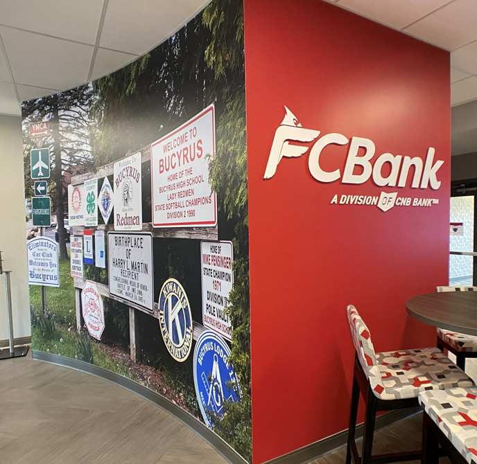
American Sign Studio decided to incorporate design elements that give a nod to the bank’s “cardinal rules.” The cardinal is an original part of the bank’s branding, and it is featured throughout, including at the top of the graphics of the cardinal rules on display in the break room and offices.
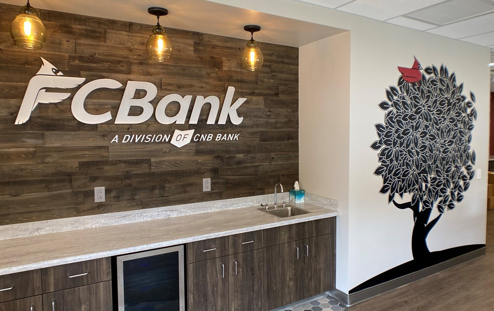
“Since it’s a cardinal rule, I said, ‘Don’t you think we need a tree?’ So we designed this tree with a little red cardinal in it, and every branch has this now, it’s right when you walk into the bank,” explains Hegg.
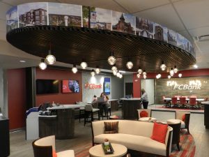 Photos selected by FCBank of specific attractions and areas of interest around Bucyrus were also used to tie community into the design. Forty-two community photos are featured around a soffit in the lobby. There are also two large format community photos that were printed out using an HP Latex 365 printer and applied to curved walls in the bank.
All of the interior vinyl graphics were printed on Avery Dennison® MPI 2923 Matte Easy Apply™ Vinyl.
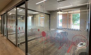 In addition to the printed graphics, American Sign Studio also installed privacy film on the glass walls of some of the offices and meeting rooms. 3M™ Crystal Glass Finishes 7725SE-324, Frosted Crystal was used for the privacy film. The sign company used a combination of dusted crystal dots applied second surface and larger grey and red circles applied first surface to give the glass a dimensional effect.
Speaking of dimensional, a few built signs were also included in the interior rebrand such as brushed metal letters that were pin mounted to the wall with an almost one-inch stand-off.
Acrylic letters painted red and spelling out “FCBank” in front of a tile wall proved to be a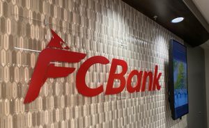 particularly tricky installation. At first, American Sign Studio considered drilling into the tile to mount the letters, but they were concerned about cracking the tile.
“I’d say we had fifteen different versions and then finally we had the idea to hang it from the ceiling,” says Hegg. “So we used different ceiling mounts and a cable, and we were able to make it look like it was floating.”
Earning Exterior Signs
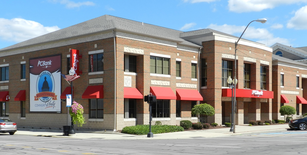
The exterior of the building, which takes up a full city block, also got in on the makeover.
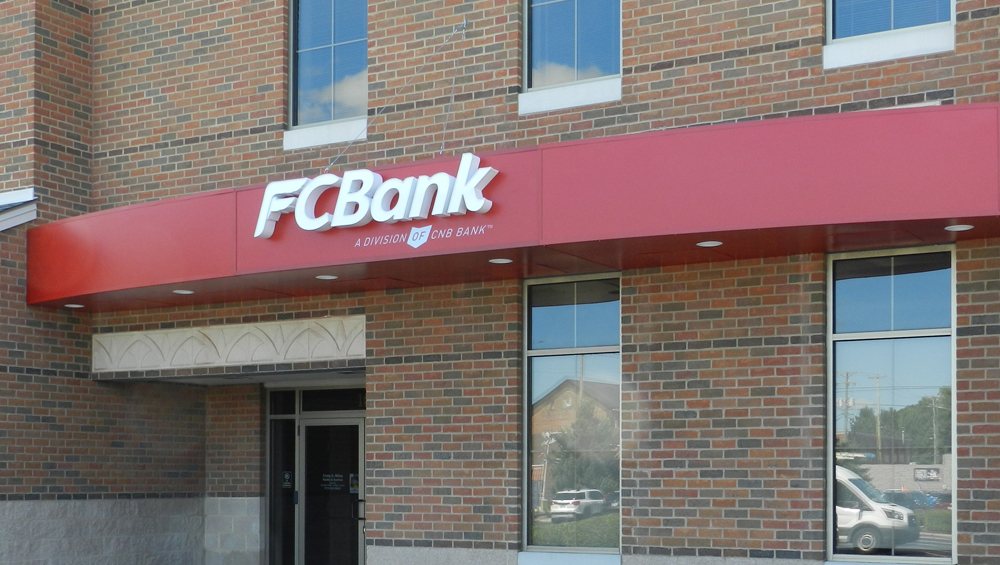
Previously a small set of letters spelling out FCBank at the front of the building were all that marked the bank’s location. For the redesign, American Sign Studio completely transformed the building with a number of bright red awnings and three large exterior signs.
“We worked pretty diligently with the building department and with the government; because it’s a small town, we had to go get zoning approval and that kind of thing,” explains Hegg. “We ended up needing engineering drawings—not just for the awnings but also for the thirty-four-foot signs that we custom built for the front of the building and also for the back. We had to get an engineer involved to come up with how to properly build and then install those, so that we wouldn’t end up with any issues.”
The awnings were made from Sunbrella material, and American Sign Studio outsourced some of the structural construction for the framework before installing them on the building.
The three large exterior signs included a custom-built façade with channel letters on the front and back of the building and a blade sign on the side. (Note: The flex face sign on the side of the building was fabricated and installed by a billboard company using a Sign Comp frame and flexface material.)
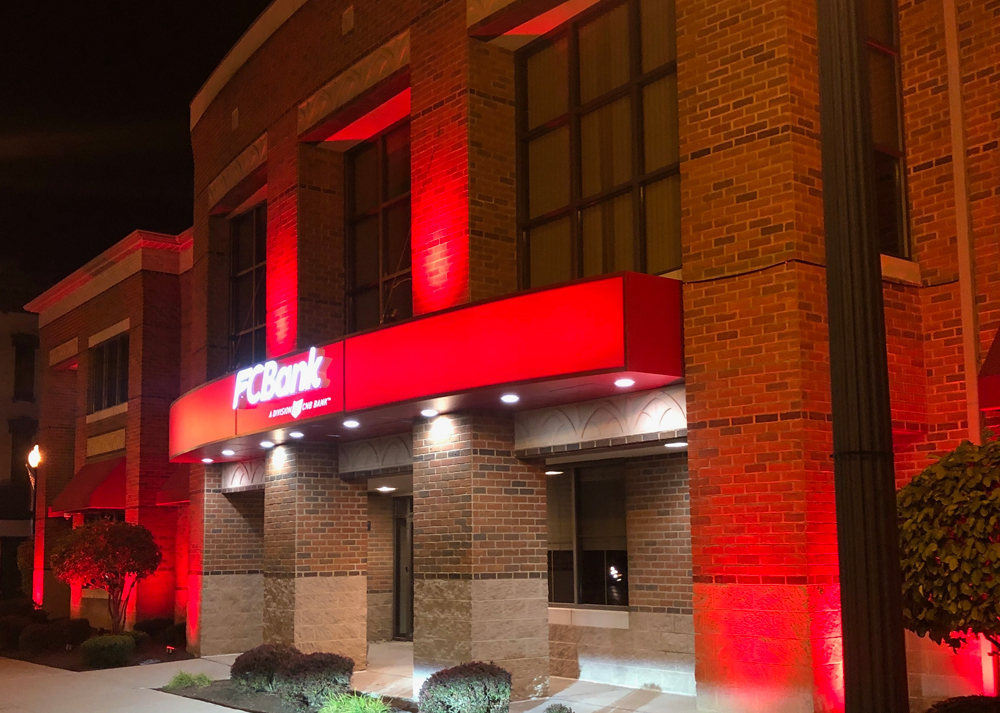
For the façade piece in the front of the building, American Sign Studio went through a number of iterations. “We did about fifteen to twenty renderings for FCBank to get this right. There was a conversation that they really wanted that front band to be illuminated. So that took a lot of creativity on our part as to how was this going to be executed,” says Hegg. “The front of the building is actually rounded [and] curved, so we had to build [the façade] in three sections. And each one of those sections is built around a pillar in the front of the building.”
The façade is constructed from aluminum channels with a number of access panels built in. The thirty-four-foot face is made from polycarbonate and is painted second surface with Matthews Paint. The face illuminates at night, along with the channel letters attached to it spelling out “FCBank.” The entire thing is illuminated by Zlight LEDs with Allanson power supplies. Exterior lighting also shines up and down onto the pillars.
The back façade was constructed in the same way, without the challenges of the curved building front. The blade sign on the side of the building was also constructed from aluminum channels with a polycarbonate face illuminated by Zlight LEDs with Allanson power supplies.
To install the three signs, American Sign Studio used a variety of Elliott service trucks. The sign company used bucket trucks for the facades and a crane for installing the blade sign.
In total, the project was completed in two phases, with phase one being all of the exterior work and phase two moving on to the interior.
“We took a long time to come up with the exterior signage; I’d say months. But then once we had everything solidified, I’d say everything came together in 90 days,” says Hegg. “We figured out not just the design but also how to project manage it so that it felt like the community was wowed overnight.”
Conclusion
American Sign Studio wowed FCBank so much with the final result that they’ve secured more work with the bank. “There’s actually a second level to that building that they want to make into community-shared office space, so that will be something we’ll work on in the future,” says Hegg. “And we’ve been invited to do their next branch as well.”
Bucyrus Mayor Jeff Reser was also impressed by the bank’s transformation. “At the ribbon cutting and grand opening, we had the opportunity to meet the mayor, and he invited us to sit with him at lunch,” says Hegg. “He went on and on about how impressed he was with the project, that we exceeded expectations, and that we were helping create a new standard for that town in terms of signage and exterior branding,”
“People were immediately writing notes to the bank saying, ‘Wow, what a great job,’ ‘how transformative this is,’ [and] ‘you really helped elevate our community.’ Everyone was so pleased, and we were just thrilled.”


