
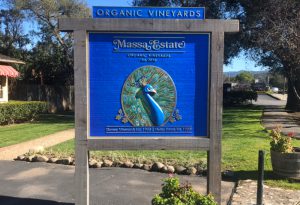
 Massa Estate is an award-winning, premium winery that’s located in Carmel Valley, California. They produce 100-percent certified organically grown wines that are also bottled there. Massa Estate recently took over the property from a previous winery, and because of this, they were looking to update the welcome sign in their parking lot.
The original property had been a tasting room for twenty-five years, and during this time, they had been using a vinyl print slipped onto an original sign bracket. This result captured the look and feel of the Carmel Valley area; however time and weather had rendered this sign in horrible shape.
Massa Estate Owner Laurie Massa approached our company, Signs By Van of Salinas, California, after hearing referrals for us through word of mouth. She had also been inspired after seeing examples of our work featured on our Instagram account (@Signs_By_Van).
Since her winery is more artistically inspired, Massa wanted us to create a new sign based on one of their wine labels. The first thing we noticed about the label she brought us was that it was very complex. However we knew right away that its design, featuring a colorful peacock bust and feathers surrounded by gold winery vines, had more potential to make this sign stand out amongst the rest in the area.
Selling this project at the outset wasn’t exactly the easiest though. So we invited Massa to visit our facility and see the forty years’ worth of custom work on our walls. She also watched our bevy of phenomenally talented artists and designers working on other projects. Soon she was sold! Now we just needed to deliver.
The end-result was a 60-by-52-inch double-sided sandblasted western red cedar sign featuring intricate painting, CNC-routed and hand-carved DUNA-USA CORAFOAM® high-density urethane add-ons for the peacock bust, and 23K patent gold leaf letters and borders.
Building the Sign
The design process was pretty straightforward. The real work began as we wrapped our heads around the build process and how to replicate a printed label onto sandblasted wood and foam.
We had our designers layout the wine label sign in Adobe Illustrator® and check the sizing and borders before cutting the stencil.
We ordered 2-by-12-inch Western Red Cedar blanks from Jackal Enterprises in Watsonville, California. Once they arrived, we processed the individual two-inch-thick pieces through our planer.
We then took the Western Red Cedar boards and joined each of them with biscuits and Titebond II premium wood glue. We let the glue dry for seventy-two hours before taking the clamps off.
We then cut the Western Red Cedar blank to the rectangular shape and size of the sign.
We created the fifteen-pound-density CORAFOAM Peacock’s breast using Fusion 360 CAD software (which I believe is the future of 3D routing). We then routed out the bird shape and general depths on our SCM Morbidelli M-100 CNC router. We’ve been sandblasting, routing, carving, leafing, priming, painting, installing, and even replicating molds using CORAFOAM HDU for over twenty-five years now. The fifteen-pound density is lighter, yet super dense; it also carves, routes, and sandblasts incredibly! Once the shape of the bird was cut out, we began the final carving of it by hand.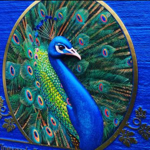
We then cut Hartco S930 30m sandblast stencil out on our Roland GX-400 and applied it to our Western Red Cedar blank. Sandblasting was done on both sides of the sign. Due to the sign being double-sided, we blasted each side down approximately 0.25-inch leaving 1.5 inches of solid material after sandblasting.
Next we used Bondo® filler to fill any voids or rough spots on the wood that we couldn’t sand away.
After sanding down the Bondo, we applied two coats of Behr Ultra Premium exterior paint-and-primer-in-one for the sandblasted Western Red Cedar background and let it dry for a day to cure.
Then we sprayed on two coatings of Nova Pearlescent blue paint with an automotive gun in two coats for the background color.
Our muralist and long-time friend, Mr. Dong Sun Kim, then took over the project. He began hand-painting the detail of the peacock in the background with Nova Paint. He used a photo of the wine label as his reference; there were no fancy tricks or patterns.
Once the first side was finished, we took a photograph and printed it out for Mr. Kim to use as a reference to paint the second side as close to matching as possible. It took him five days total to paint the plumes of the feathers, the heads, and the breasts of both peacocks, while during this time, we were making the headdress surrounding it out of stainless steel, foil, and paint.
The cool thing about this is that the peacocks are really custom-painted, since Mr. Kim hand-painted both sides a little differently. Score one for the human touch!
After all the painting and mural work were completed, we applied Giusto Manetti Firenze Gold Beaters 23K patent gold leaf supplied by Goldleafimportexport.com out of New York.
We prepped the paint to receive Charbonnel Mixtion à Dorer Lefranc 12-hour formula gold leaf sizing. We bunched up as much sizing as we could in order to give a bubbled-up effect on the lettering and borders. We let the sizing dry for twelve hours (or until it had tacked up, as needed) and then proceeded with leafing the sizing. (Note: To learn more about the process of gold leafing, turn to page 22.)
The only components attached to this sign were the two peacock busts. We attached the busts by hammering small nails into both sides of the Western Red Cedar and cutting the heads off. We then pushed the bird busts onto the nails using clear silicone as the adhesive. This ensured a tight fit and guaranteed that the piece won’t ever fall off.
Whitening the Posts
At the job site, we ripped out the entire pre-existing sign structure and built the box frame out of six-by-six-foot pieces of Clear Heart Redwood beams.
However, our client wanted this sign to look as if it had already been on-property for a long time. So we took measurements, planed the beams down, and lag-bolted them together. We had built the sign panel inside a tight seam within the frame so it wouldn’t move. When you’ve got two-inch-thick pieces of cedar, you don’t want it to bow or warp.
We then took Behr Ultra Premium exterior white paint and crafted a mixture of 90 percent water to 10 percent paint. We grabbed a rag and wiped the mixture onto the beams.
Once completed, we next took a dark grey 9:1 mixture of paint and water and rubbed in the dark as needed until the desired texture was achieved.
Installation of the beams consisted of boring through parking lot asphalt fourteen inches in diameter. We dug through four to six inches of this asphalt to hit paydirt. We went down approximately thirty inches into the ground, dropped the main beams into the ground, and poured in Quikcrete concrete.
We watered the concrete mix to solidify it, and following that, we cleaned the site. We were finished!
Conclusion
The contrast of the sign to the frame is ultimately why the sign stands out in its environment. Then add in the distinct pearlescent Nova blue and the dimensional peacock, and voilà, this sign makes for an incredible design—all thanks to our team of talented sign makers!
Anytime you have a client that is very particular about their logo or image—especially one that was this detailed, you have to deliver.
We encourage shops to contact us if they have any questions about materials and processes. We’re also excited that we’ve just finished filming the third episode of our Signing the Gold Coast sign reality series that deals with clients and sign-making projects appearing weekly on our YouTube channel. Check it out!
By Jeremy Vanderkraats, owner of Signs By Van in Salinas, California.


