
Nazdar celebrated the 100th anniversary of its foundation with the official launch of a refreshed brand identity. Nazdar’s new look reflects the company’s celebratory milestone and its commitment to innovation and growth as they embark on the next 100 years.
The new logos were presented to employees, board members, shareholders, and retirees at their global, company-wide anniversary celebration on May 13, 2022. “We are proud of this milestone and thankful for the people and partnerships that have helped us achieve it,” said Richard Bowles, President and CEO of Nazdar.
“The new brand identity reflects our company’s values, history, and future. Nazdar has a culture that values our customers and employees with a mission to exceed our customers’ expectations by delivering innovative print solutions. We are excited to introduce a fresh look that stays true to our roots but better reflects who we are today as we take our company and customers into the future.”
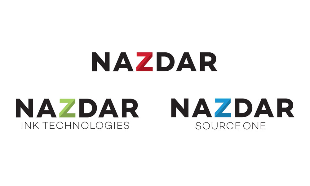
Nazdar’s refreshed logos features intentional design elements, including:
- The Z element remains in the logomark but refreshed in a way that keeps it within the bounds of the word. This shows the logo’s simplicity as a whole; that it is one strong piece.
- The Z is divided into two shades of red for two reasons:
- The first and primary meaning is to show one Z made up of two parts – manufacturing and distribution. Without both, the Z would not be whole.
- The second meaning is a nod to the 100th anniversary—the two parts of the Z mimic arrows. The lighter part conveys a forwarding-thinking future—soaring ahead. The darker part reflects Nazdar’s past and it’s celebrated as a part of what Nazdar is today.
- A sans-serif font that is bold and strong, yet open-set suggesting friendliness and openness.
Nazdar is comprised of two divisions, and varying color pallets are implemented to visually represent each: green for Nazdar Ink Technologies and blue for Nazdar SourceOne. These have been used as primary colors for each division over the last eight years. Recognizing the equity that has been built over time, the colors are integrated into their refreshed logos. This provides a distinct look to differentiate the divisions to the various markets they serve.
The logos will be rolled out in a staged approach over the next weeks and months.


