
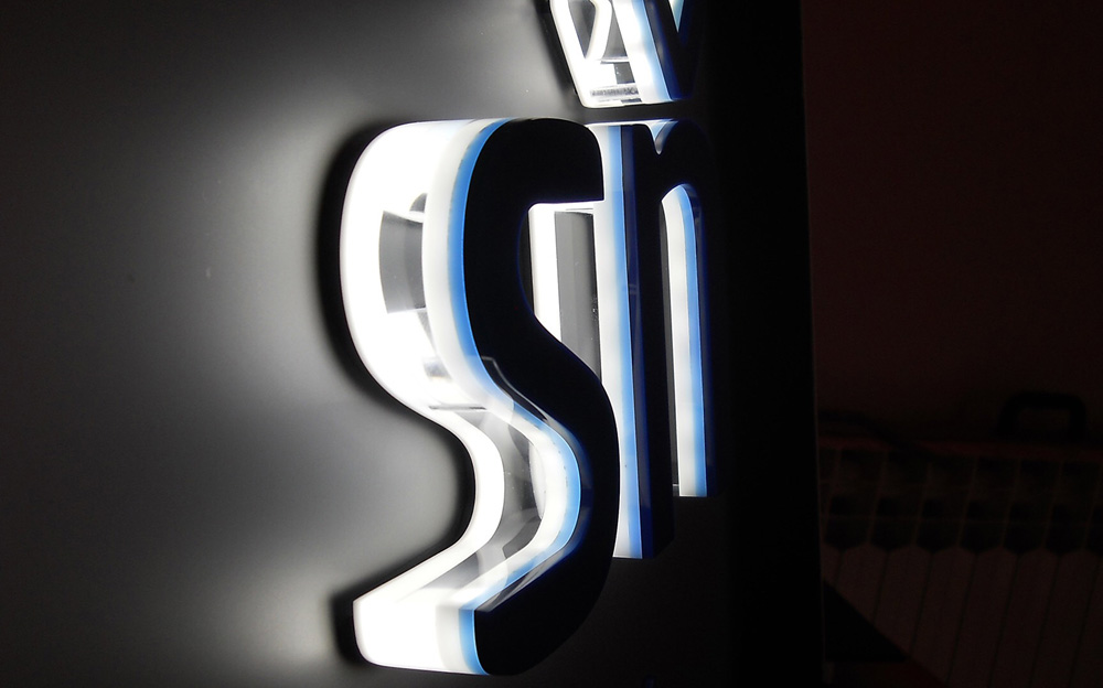
Backlit channel letter signs are mounted away from the wall, which causes the LED modules to form a halo effect from behind the sign. These types of letters not only add an elegant look above entrances, in exhibits, or on monument faces, but also avoid unnecessary light pollution.
“From our experience, upper-scale store fronts, in particular boutique, premium-positioned restaurants, and hotels that want a subtle, sophisticated branding look without ‘blaring’ [it] out, are ideal for halo-lit channel letters,” says Kenan Hanhan, president of Provis Graphic LLC, a European company now moving into the North America market. “There are also great applications in interior place-making/experiential environments—from museums to theme parks.
“A lot of it also comes down to simple aesthetic preference.”
To achieve the appropriate backlit aesthetic, Hanhan says lighting designers should question their wholesale letter manufacturer-suppliers to find out which way their LEDs point. “The best halo light diffusion quality comes when the diodes point toward the inside of the face of the letter, reflecting the light back to the mounting surface,” he explains. “This increases the light wavelength before it hits the mounting surface and avoids the unsightly reflection of the diodes off of the mounting surface.”
Colin Woodford, marketing associate at LED kits and fixtures manufacturer GE Current, A Daintree Company, agrees that LEDs pointing inward results in an even or diffuse halo effect. “Spacing the modules evenly can also assist in attaining even illumination,” he says.
Woodford adds that since each project a lighting designer encounters is different, it’s difficult to generalize halo-lit advice for LED placement inside or behind the letter; however his company has made some observations. “Placing LED modules on the back of the letter, recessing them in a channel on the back of the letter, or placing the modules on a clear/diffuse backing facing into the letter are the most common,” he states. “If it’s a smaller or more challenging application, placing the modules on a clear backing and having them face back into the letter will likely give more uniform results.
“You can also play around with how far the modules are positioned from the edge of the letter to change the effect of the halo, as well as modifying the distance between the sign and the surface that it’s mounted onto.”
The size of the letter(s) and its distance from the surface will also have an effect on LED placement. “Generally letters deeper than about three to four inches may require two strings of LEDs to achieve uniformity,” says Woodford. “Another option, depending on the letter set, may also be to place the modules on the back of the letter faces, facing the wall/surface the letters are attached [to].”
The distance between the letter set and the mounting surface will affect the halo look and the amount of light that must be used, and it’s because of this that Hanhan stresses the importance of optimizing the mounting distance.
“Of course, there are so many variables here—including the size/depth of the letter, the type of mounting surface involved, and whether the sign will be viewed at a close distance or not,” he says. “[But] typically we find that standoff distances ranging from 3/8-inch for small letters viewed up close to up to 2.4 inches for larger, deeper letters work best.”
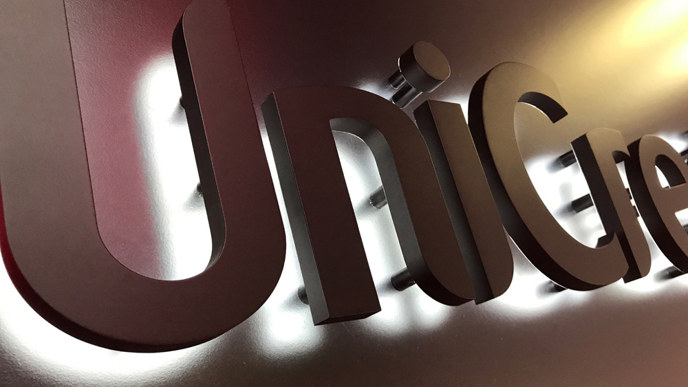
Mounting hardware should be placed in the area the modules are placed and not located along the outside of the letters (as doing so may block light). “Placing the hardware in the middle of the letter will eliminate the possibility of shadows,” says Woodford. “If this cannot be done, the modules will need to be placed strategically to minimize light blockage.
“More modules may need to be added to eliminate shadowing.”
There are several other things lighting designers can do when playing around with the look of backlit illumination.
“Colors that contrast with the letter itself, if illuminated, can make the sign stand out,” suggests Woodford. “Changing the mounting distance can influence the look; do you want a tighter halo or a softer, cloudier halo?”
If you’re looking for something softer, Woodford says that you can increase the distance of the LEDs away from the mounting surface to do this. “You can even look at the surface material the letter set is mounted to,” he says. “Different surfaces will disperse the light differently, giving different effects. Try to stay away from an extremely reflective surface though; this can act like a mirror and show the LEDs.”
So are there differences you need to consider when designing halo-lit LED channel letters that are going to be installed above the sight line of the public as opposed to eye-level?
According to Hanhan, the biggest differences are the type of letterform used and the length of the standoffs. “When letters are viewed up close, we like the precision look of cast block letters that cast a great halo at short standoff differences, so the standoffs are also not as visible,” he says. “Traditional trim-capped letters or even trim-less fabricated painted aluminum or stainless steel letters don’t look as attractive close-up in our opinion.
“Also, when looking at halo-lit letters above the sight of line, you can get away with longer standoffs (to optimize the halo diffusion), because the standoffs are not as noticeable at that distance.”
Woodford says that GE Current always recommends testing the design before proceeding too far into the backlit fabrication process. “If possible, be sure to view the test sample while standing at least twenty-five feet away in the dark,” he advises.
Hopefully the preceding advice gives you some backing to help make your next backlit project a glowing success.
—Jeff Wooten


