

Bell Works Chicagoland is a new “metroburb” located directly off busy Interstate 90 in Hoffman Estates, Illinois. Its first phase of development opened this past September. The “metroburb” concept cleverly combines “metropolis” with “suburbia,” creating a destination where people work, live, shop, and eat.
The refitted 1.6 million-square-foot campus once served as home to AT&T’s corporate headquarters, but the tech giant had vacated it in 2016.
In 2019, Inspired by Somerset Development purchased the abandoned campus with the intent of redeveloping and rebranding it as Bell Works Chicagoland. The intent here was to create a destination for businesses and culture unlike any other in the area.
One thing at the top of the developer’s mind was the post-COVID landscape and the changes it had wrought. With companies concerned about bringing employees back to the office, Inspired by Somerset Development knew it had to create unique spaces for any-size business while still allowing the opportunity for future growth.
Another big problem they faced—no one really knew about this new development project and future campus.
Simultaneous to construction, it was imperative to publicize the property to attract tenants. Since the metroburb was the first of its kind in the area and set back from the Illinois tollway, increased awareness about the campus was instrumental from the very beginning. There was a need to secure tenants, publicize the project, and provide on-campus wayfinding information.
Inspired by Somerset Development brought onboard New York-based Union Design, Chicago sign company iBrand Visual + Pryor Signage, and branding partner npz studio+ to handle the different branches of this rebranding project.
Everyone agreed from the outset that digital signage would be the ideal solution to solve their awareness challenge and accomplish Bell Works Chicagoland branding objectives.
Inspired by Somerset Development had already begun interior and exterior signage. “iBrand Visual + Pryor Signage proved to be a great partner because of their know-how and knowledge of digital signage,” says Jack Aber, COO at Inspired by Somerset Development. (Note: Aber says that two qualities he looked for when finding sign companies to handle digital installations are “experience” and “attention to detail.”)
All the companies involved selected Optec Displays https://optec.com/ to implement their visions for this project.
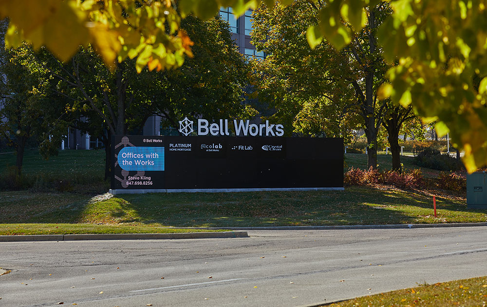
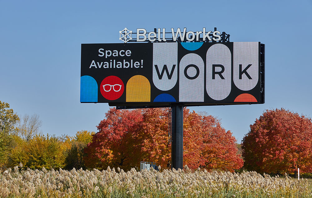
Seven Optec INFINITY electronic displays and large double-sided billboards have been installed—a trio of 7-foot-1-inch-by-7-foot-4-inch 10mm displays installed into monument signs at the main entrances; a pair of 3-foot-2-inch-by-4-foot-2-inch 6.67mm displays placed within monument signs located at both the East North and East South entrances; and two 16mm RGB double-sided 20-by-60-foot electronic billboards that are visible along the interstate.
Permitting turned out to not be an issue as Union Design and iBrand Visual + Pryor Signage’s design and fabrication intent checked all the boxes for the Village of Hoffman Estates. “They understood the large development project and worked with Bell Works for the development covering all the campus signage,” says Eric Wiiken, partner at iBrand Visual + Pryor Signage.
Clint Bottoni, co-founder/managing director at Union Design, says that his company followed the guidelines set by the town. “These mostly had to do with setback and the height of the signs at road entrances, as well as the billboard,” he says.
When creating the signage survey, Union Design made sure to focus on creating visual impact at each entrance into the campus. They also positioned flags in different spots along the highway and drove past them from both directions to gauge visibility. “This allowed us to determine the [proper] billboard locations,” explains Wiiken.
Monument signage hosting the INFINITY displays are all-white, 1/2-inch-push-thru logos featuring the tenants’ logo with a black cabinet to provide the 100 percent contrast that makes the impact with the EMC adding color and creating action for each sign.
All monument signs were inserted into a concrete base. “An extra twelve inches raised the base to protect the bottom of the signs from being hit by the landscaping lawnmowers in the summer and be above the snow in winter,” adds Wiiken.
The billboards were installed on steel structures twenty-two feet below grade in a concrete foundation. “The steel structure rose fifty feet above ground,” says Wiiken, noting that the billboards can be seen from either east or west direction from Interstate 90.
Union Design designed and developed content management so that the on-site user can easily change and schedule content on all screens. Due to viewers seeing these signs from cars moving at high speeds, Bottoni finds that simple promotional content on the digital signage works best. “This means solid-color backgrounds along with very short messaging using large typefaces,” he explains. “If imagery is used, the images should be easily recognizable and not busy.”
All of the on-campus displays are engineered to withstand the wide-ranging Midwest weather conditions and integrate with Union Design’s custom content management system.
“The products are run through a litany of lab tests to ensure dust, moisture, salt and effects caused by high heat or extreme cold are addressed to safeguard all components for many years,” says Chad Engstrom, vice president of Strategic Partnerships & Development at Optec Displays.
The displays also use light sensors to control brightness by measuring the ambient light levels. Optec Displays took extra precautions with the two 20-by-60-foot billboards so as to ensure maximum daytime brightness. This process included an engineer at Optec’s corporate offices in a California making adjustments remotely while on-site representatives visually verified the brightness onsite at Hoffman Estates.
“More importantly, we lowered the brightness levels for nighttime viewing, as we felt the default low-end brightness reading was too high,” says Engstrom.
The billboards also include a hardware and software platform to remotely manage high-voltage power. This allows teams to easily reboot specific devices, such as a video player or ISP equipment, to resolve outages due to locked up equipment or improperly displayed content.
Once the displays were installed and the wireless connections set up, Union Design easily loaded the content management software system.
The ultra-bright, full-color LED displays feature rotating messages developed by npz studio+. The content is focused on leasing, Bell Works branding, tenant promotions, and event announcements. The billboards include the same content and can be seen for miles away along the highway.
Accompanying the digital signage are static graphics that do an effective job further providing branding for Bell Works Chicagoland. “Digital signage provides a way to connect the brand to the space in an innovative way while maintaining the brand’s values,” says Paola Zamudio, founder and CEO of creative firm NPZ Studio+, a creative firm with graphic designers and marketing specialists that mixes visuals to promote the Bell Works brand.
Zamudio feels it’s important for the space, the brand, and the digital message to be connected. “What we did at Bell Works Chicagoland also works for other buildings—especially office buildings that need an identity,” she says. “It’s already a beautiful building, but how do you make it cool? How do you make it special?
“I wanted to make sure there wasn’t an overload of signage and that everything was well curated in the space. At Bell Works Chicagoland, we created the brand and made sure it was consistent throughout the space and that the signs had all the right fonts, the right colors, and the right look and feel.”
Zamudio worked with the town to make sure they had the right amount of signage. “I like the ‘less is more’ approach,” she says. “We wanted to have the right amount of signage on campus, and I think it works here.”
—Some content appeared in a released case study.


