 By Jeff Wooten
Monkeys have long played effective partners. Tarzan had Cheetah. Clint Eastwood had Clyde. Cornelius had Dr. Zira.
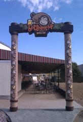
And the Bottoms Up Patio Bar in Sioux City, Iowa has their colorful monkey mascot, which they use prominently in their branding. Swinging carefree with a frosty mug in its hand, this playful primate promotes the good times awaiting all visitors. Marketing campaigns use this simian icon to stress to patrons that it’s a “jungle out there,” so they should look to “escape to the jungle” inside.
The Bottoms Up Patio Bar opened for business this past summer at the Rush Werks Entertainment Complex. This locale hosts five entertaining hot spots (ranging from restaurants to bowling alleys to miniature golf), so it’s a no-brainer that, with its outdoor patio, sand volleyball beaches, and tropical theme, the bar would make an ideal tenant here.
Before opening, the bar owners knew they were going to need some kind of lighthearted sign to play off the monkey mascot. But what kind of sign? A ground-level monument? An internally illuminated sign cabinet? A wide format wall covering?
The sign makers and designers involved in this project didn’t monkey around. They successfully came up with a unique, double-sided, fifteen-foot, eight-inch-high-by-ten-foot-wide pylon sign consisting of two custom-crafted 12-5/8-inch pole covers and a top. Adorning the columns are embossed monkeys, palm fronds, and beer steins hand-carved from cellular plastic (expanded polystyrene EPS foam).
Sure the sign may be whimsical, but according to all involved in its creation, the message it portrays is some very serious (monkey) business!
Monkey See: Design
Earlier this year, Bottoms Up Patio Bar owners drafted JD Gordon Advertising, also of Sioux City, to come up with design ideas for an identity sign. The owners only knew they needed something located at the front entrance that would fit the allotted vertical space [I]and[I\] attract customers.
 Angie Kennedy, art director at JD Gordon, had to keep two things in mind: (1.) The establishment was an outdoor bar with an entrance coming straight off the parking lot, and (2.) the sign needed to have a “beachy,” tiki theme. “Creatively I wanted to make an impact whether you were coming or going, so I explored some more humorous approaches to the design,” she explains. “To differentiate this entrance from the others at Rush Werks, I created an archway for people to walk through. This featured tiki-like poles and the logo front and center.”
With the design in motion, the owners contacted Avery Brothers Sign Company, also of Sioux City, asking to make this sign a reality. Avery Brothers has a long history of quality design and craftsmanship (founded in 1935!) and had already built and installed five new exterior signs for the Rush Werks complex. After hearing the pitch, Steve Avery, co-owner of Avery Brothers (along with his brothers Milt and Noel) was ready to tackle this idea. “We get excited any time we have a chance to be involved in a unique project,” he says.
Since Avery Brothers would be constructing the steel framework for the sign and handling its installation, Steve turned to sign supplier Signs By Benchmark of Watertown, South Dakota for the remainder of the work. (Note: Avery has worked with the company several times before and has always been impressed with the results.) “At that time, it was really just an idea of some bamboo sticks holding up a sign with a monkey on it,” says Matt Frey, division manager at Signs By Benchmark.
With an eye toward practicality in the build process, Frey made a couple more design suggestions. For starters, he pointed out that there would be a need to hide the two poles supporting the main arched sign. His suggestion: Using totem poles for covers. “Because of their round shape, they would work well to slip over the two, ten-inch steel poles that had been agreed upon,” he says.
 Frey then drew up a quick pencil sketch to show Avery. “Within days, we had three new conceptual designs that incorporated the totem pole design with monkeys carved into them instead of traditional totem-type faces,” says Frey. (Note: Signs By Benchmark likes to get the installer involved from the start. “We like to think of the installer as a customer too,” says Frey, “and getting their input on design is key to a successful project.”)
Avery sent these suggestions back to JD Gordon, and Kennedy did some further tweaking. For the front sides of the poles, she expanded the monkey character by putting him in different positions. She then incorporated vines to visually connect each monkey, as it repeats down the length of the poles.
For the archway sign panel, Kennedy focused on the Bottoms Up logo and the monkey’s face—with a few changes. “The actual Bottoms Up logo has the monkey’s body and tail coming from above, making it appear to be hanging with its bottom up in the air,” she says. “I removed the body and tail, to make the monkey’s face as large as possible for the space allotted.
 “I then designed the back of the sign so that the monkey’s rear end would be sticking out through it, making it appear as if he had busted through it.”
The “hang out again soon” wording on the back of the poles was inspired by the monkey logo used. “It’s a clever way of saying ‘goodbye’ through the sign and inviting [visitors] to come back,” says Kennedy.
Monkey Do: Fabrication
Success! The owners approved, and JD Gordon sent the art files over to Avery Brothers—who then sent them over to Signs By Benchmark. The entire sign and its accompaniments were built out of cellular plastic (foam-core), because it is easy to cut, shape, and fabricate.
The main sign portion was built around a steel framework provided by Avery Brothers. The top portion of the sign was built in relief to provide the three-dimensional look around the framework that Avery had provided them.
 The entire top was then hard-coated and painted to match customer specs. “Once the pole covers were slid over the steel poles, the top section was lifted into place and saddle-mounted over the steel poles,” explains Frey.
Signs By Benchmark painted the sign with acrylic enamel and then applied a UV protective topcoat to it. “I think we used every painting method that there is on this project—a cup gun, an air brush, a paint brush, a roller, etc.,” says Frey.
The entire fabrication process only took ten working days, but because of the complexity of the actual display, it was a bit out of the normal for Signs By Benchmark. “There were a lot of elements to the design that couldn’t be relayed with just drawings and renderings,” says Frey.
“The drafting and design team made a lot of decisions dealing with the different layers of relief and how the sign would be painted to achieve a dimensional aspect right out on the production floor after everything had been cut.”
For example, the surface of each pole was hand-sculpted to create a wood grain effect before the embossed features would be mounted. This presented a challenge to ensure a seamless transition between the hand-sculpted wood grain surface and the embossed features (monkeys, leaves, vines, etc). “Each embossed shape had to be blended to meet the contours of the wood grain surface on the poles,” explains Frey.
Monkey Wrench: Installation
 The sign was dry-fit in the shop to ensure a smooth installation later. Signs By Benchmark then disassembled the entire sign into three sections—the two poles and the top panel.
The company then packaged these pieces in EPS foam and bubble wrap and shipped them out on one of their trucks for a ninety-plus-mile trip to the Avery Brothers facility. This packaging solution eliminated the need (and costs) of using crates.
Installation of the pylon signs by the three-man crew from Avery Brothers took only five hours. The sign was set up with the use of pre-drilled anchors in the ground.
“We used power augers and drills, a basket truck, and some other construction tools to set everything up,” says Avery. “It ended up being a very smooth process.”
Monkey’s Uncle: Reaction
Avery describes the reaction to this monkey pylon-and-panel sign as enthusiastic, to say the least. “Well-designed and well-crafted commercial signage speaks to people in the same way that any art can and should speak to them,” he says. “The sign for Bottoms Up was designed to make patrons happy!”
For Kennedy, “I love that the client was so open to such a unique approach to their signage and willing to take the creative risks that ultimately produced a final product that is fun and memorable.”
 Although this was a very complex and creative-intensive project, Frey urges other sign makers to not shy away when such requests come in. The rewards (and the relationships with those involved) can prove invaluable. “Projects like this are interesting to watch as they work their way through the shop,” says Frey. “Once they hit the floor, there’s a lot of novelty to them and everyone is talking: What’s this for? Where is it going? That’s so cool!
“Midway through the project the talk changes: Whose bright idea was this? How are we going to do that? We have to paint all that by hand?”
By project’s end, Frey says all the fabricators ended up forgetting these challenges and managed to get this monkey off their backs. “Everyone was standing back, looking at the finished display with big smiles on their faces,” he says. “They had their camera phones out, taking pictures to show their families and friends the new project they just finished.
“There was a real sense of accomplishment with everyone involved!”


