

Indoors and outdoors, effective graphic design best serves its sponsor by speaking directly to its audience. While the goal with some signs is to use them to shout their message, the challenge to more complex systems for wayfinding and public spaces can be to blend with or enhance the surroundings while informing and advising all who pass that way. Philadelphia-based Cloud Gehshan has built its reputation as a premier designer of graphic branding solutions that are visually appealing and effective communications systems. Its creative approach has earned numerous accolades and recognition and a client list any company would envy.
This success stems from what Co-founder and Chief Designer Jerome Cloud describes as a “holistic” approach the Cloud Gehshan team brings to every project. “We like to understand all the parameters, what motivated the project in the first place, and what the client hopes to achieve,” he elaborates. “We also like to know what other things are going on around the project that might impact our work or vice-versa. We’re always looking for the opportunity to strengthen that sense of place through a unified system of components.”
Ultimately Cloud Gehshan’s proposals are guided by an exhaustive investigative process.
This preliminary phase can include site audits, discussions with all stakeholders about their respective needs, community forums, and research into that locale. It’s the creative interpretation of all that data, the talents of the Cloud Gehshan team, and their collaboration with partners in each project that combine for compelling designs on such a range of projects.
A Welcoming Garden Portal
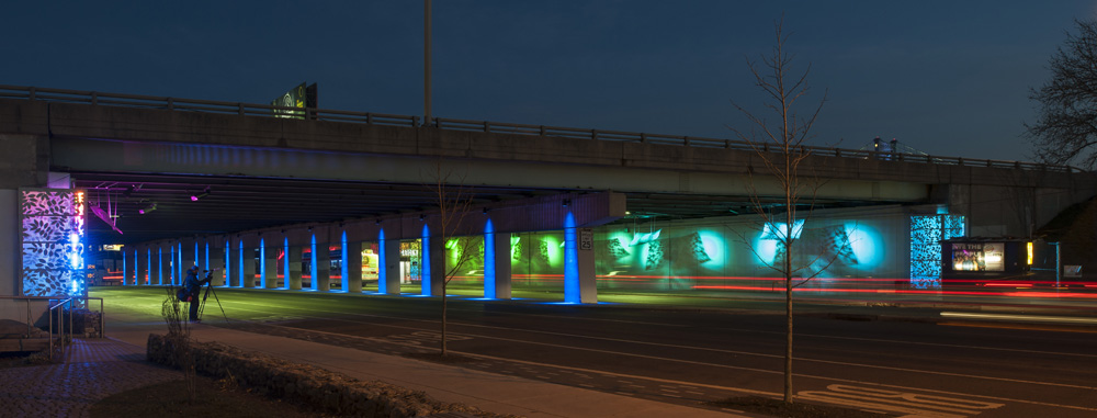
Cloud Gehshan was recently engaged by the Delaware River Waterfront Group to help rework a foreboding concrete underpass beneath the I-95 corridor into a more inviting and attractive railway entrance for commuters.
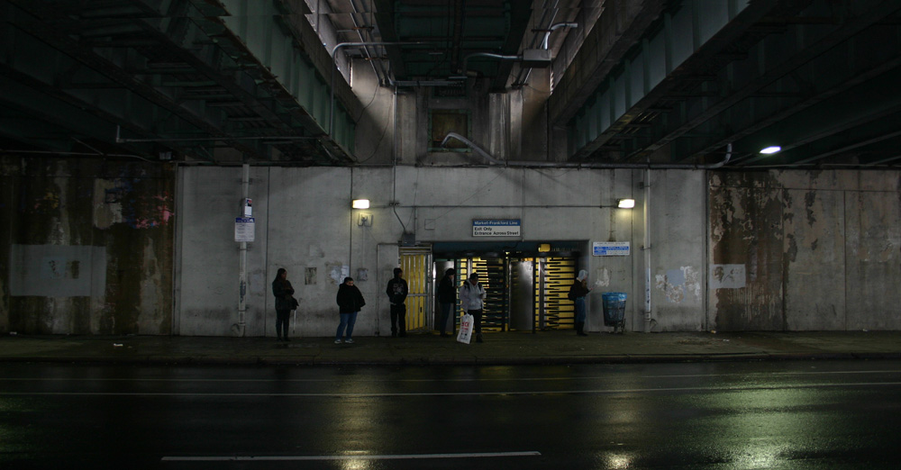 The client and its partners had already decided on a new illumination system of programmable LEDs, but it wasn’t transformative enough. Cloud Gehshan was tasked with bringing that lighting to life.
“It was dark, dank, and threatening at night,” notes Cloud. “A large number of people pass through this transportation portal going to and from the city, [so] it was important that we counterbalance the environment with something assertive and energetic.”
Research revealed a variety of wild wisteria was indigenous to the area in the 1700s. That discovery inspired the announcement of the entranceway as “Spring Garden.”
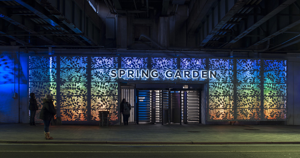
To reinforce that connection, brightly lit perforated 13-by-50-foot aluminum panels depicting a lush wisteria pattern now frame the doorway and welcome commuters to the train station. The same design pattern repeats inside on suspended lighting panels.
“In some environments, you can’t be too timid about the things you bring,” he asserts. “We looked for something in the research we could tie the area to and take away from the harshness.”
A Visual Narrative
Delving into an area’s past occasionally provides the opportunity to showcase Cloud Gehshan’s expertise and benefit an entire community.
When discussions began on resurrecting Philadelphia’s abandoned Reading Company railway viaduct as an elevated public park and greenway, Cloud was an early advocate. Ultimately the Cloud Gehshan team contributed interpretive and directional signage for the project and donated their collective talents for what is now the rail park’s iconic eighty-foot corten steel wall.
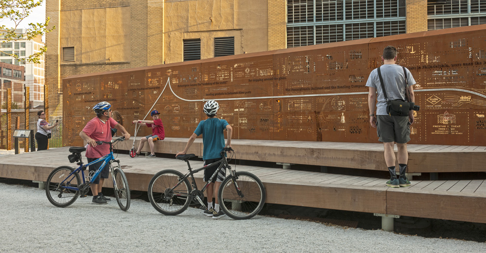
“The wall was intended to function as a barrier or screen to an adjacent building,” notes Cloud. “The people in that neighborhood told us they didn’t want anything over-themed or too assertive.”
This wall would also also serve as a backdrop to a public stage planned as a gathering point for those who enjoy the greenway.
Since the old railway traces its path through what was once Philadelphia’s industrial center (and home to both the Pennsylvania and Reading Railroads), research focused on the area’s commercial vitality in its glory days. Forgotten company names, logos, slogans, fonts, maps, and period advertisements all suggested something of that rich past.
The design team recommended combining those elements to evoke that era.
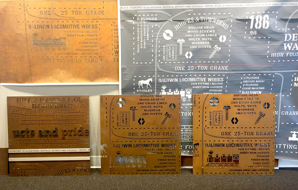
The choice of corten steel, with a surface that rusts and changes over time, implies one aspect of the district’s evolution. But it’s the visual narrative presented in the design that elevates the wall into something much more compelling.
As Cloud explains, the intent was not to overwhelm visitors, but make the wall something they could revisit and explore over time to learn the area’s full story.
“We employed an activity called ‘message mapping’ that began with gathering information about the area, the elevated train line, and its history of service to the businesses that once flourished in that section of the city,” he explains. “It literally began with a map over which we began to post images of buildings, logo/logotypes, slogans, and product images from the period. It began to tell its own lively story about how Philadelphia was once the ‘Workshop to the World.’”
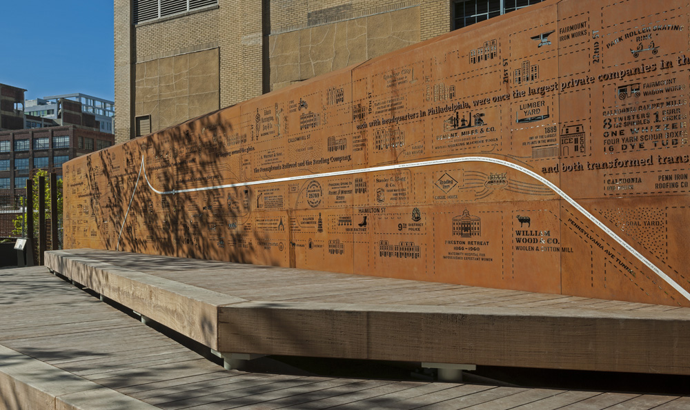
A stainless steel ribbon across the wall defines the original railway path through the district, coursing among laser-cut reminders of the many businesses served. The wall stands as a testament to a bygone era, Cloud Gehshan’s creative design expertise, and the team’s appreciation of their hometown.
“My partners and I felt since we had been awarded so many exciting projects over the years in Philadelphia, we should make a contribution back to the community,” explains Cloud. “This just seemed like the right project to make that contribution.”
(Way) Finding Complex Challenges
Wayfinding presents a design team with a much broader array of challenges and considerations than any standalone project.
“These have a complexity that has to be understood before you can begin to design a system that can serve the various communities who will rely on it,” observes Cloud.
He says the most efficient approach is usually to develop and phase in a new wayfinding system. Its design should build on, yet simplify, the branding, icons, colors, and flow dictated by navigational aids already in use while addressing any shortcomings.
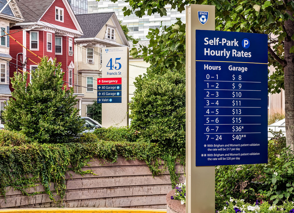
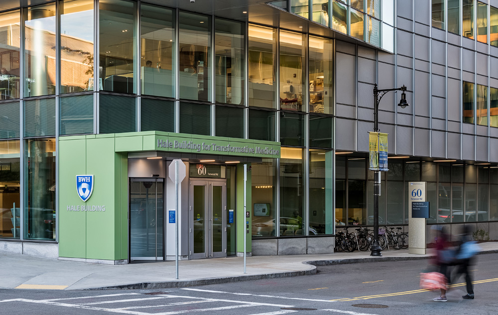
Plans for new a wayfinding system for Brigham and Women’s Hospital in Boston, Massachusetts started with rigorous assessments of the existing system and interviews with its varied users. The healthcare complex, a teaching affiliate of Harvard Medical School, includes multi-floor facilities spread out over several blocks.
“We start with a planning/programming phase where we spend a lot of time conducting audits, visually interacting with that environment to determine what’s easily understood and what isn’t,” says Cloud. “This can entail cataloguing signs and symbols already in use, how and where that information is presented to users as they navigate the complex, and interviews with staff, visitors, and patients.”
The distinct needs of patients are a guiding priority in the design. “You have to understand what issues patients face from the time they leave home, as well as the needs of others who will rely on that system,” he says. “That includes every step along the way on their journey from the external to the internal environment.”
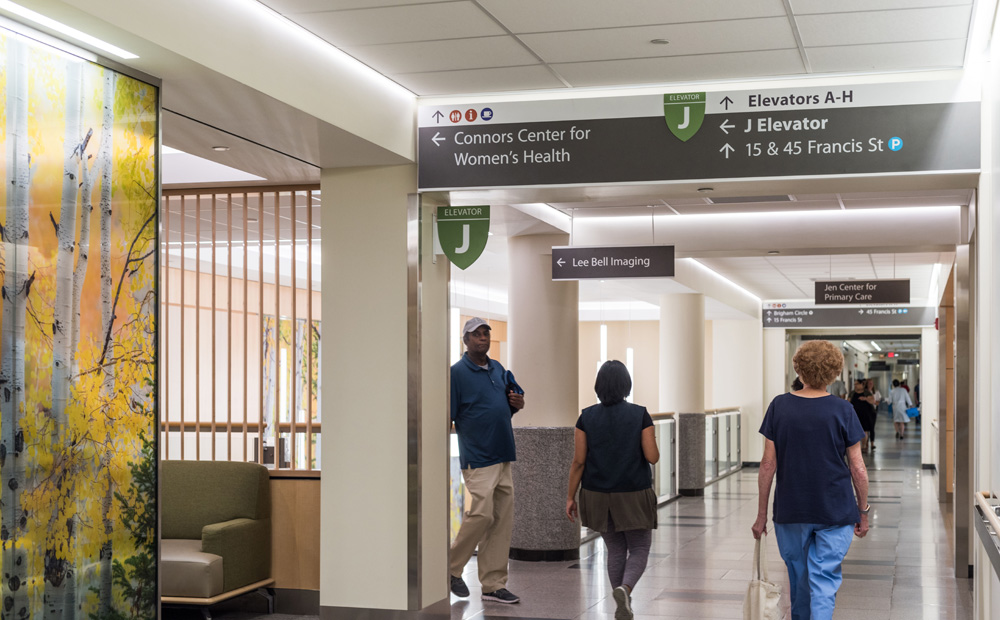
Cloud Gehshan’s design team gathered all that data, evaluated its many implications, then worked to streamline navigation to or from any location. Their design presents users with essential information where they need it in ways readily understood. The wayfinding system also helps brand the complex and facilities with easily identified sign types, colors, and icons to intuitively guide staff and visitors throughout the complex.
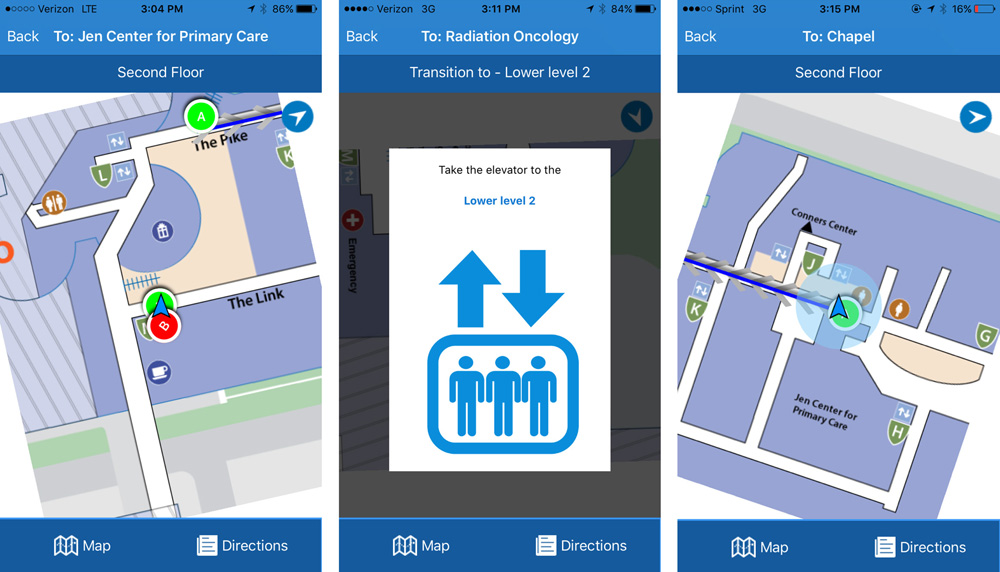
The system can seamlessly grow as facilities expand and embrace viable new technologies as they appear. It includes digital display panels in select locations, and patients have access to a branded mobile app and searchable Web site for step-by-step directions before they even leave home.
“Today’s wayfinding systems have to recognize the new tools people are using to reach their destination,” notes Cloud. “The design has to be one that can evolve as those tools change.”
—Michael Antoniak (Sign Builder Illustrated, July 2019)


