
Quint Creative Signs in Piqua, Ohio specializes in designing and fabricating custom dimensional signage. Brian Quinter started up the business part-time on his own back in 2000 before moving into it full-time in 2004. Today the four-person shop crafts stunning custom signs made from Coastal Enterprises Precision Board™ high-density urethane (HDU) that are setting their clients apart from others.
At the beginning of these projects, Quinter will often meet with clients on-site while he surveys the surroundings and takes pictures. These photos help him create mock-ups. He works up these images in CorelDRAW, edits them in Corel Photo-Paint, and exports the bitmap vector artwork into Vectric Aspire where he further turns the artwork into a 3D sign appearance.
“Vectric Aspire allows us to experiment with different textures and 3D element for the signs. We can preview the sign and are able to spin it around and view it from any angle,” says Quinter, noting that he shares this file with his customers for further modifications and approval (either through face-to-face discussions or electronic means).
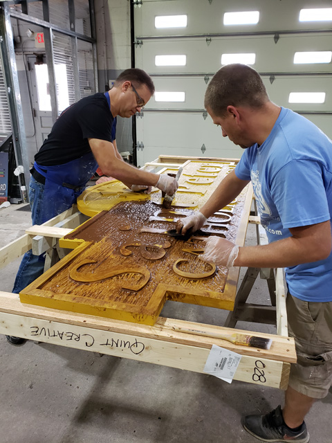
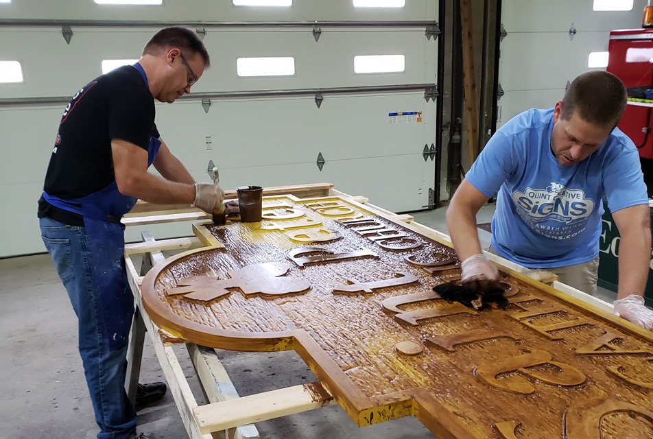
The shop’s motto is that if they can design it, then they can machine it with HDU. They use a 0.25-inch ball nose bit on their AXYZ CNC router when creating all the texture and 3D elements, and 0.1875-inch and 0.25-inch end mills for the rest. If there’s need for a beveled edge, they’ll employ a v-carve bit and toolpath. They rarely have any need for sanding or finishing after carving.
Quint Creative Signs typically uses Sherwin-Williams DTM and Resilience paints, however, they also love Nova Color. “Most of their colors are very opaque, and there are very few coats you need to apply,” says Quinter. “For example, if you have a painted black background and need to paint white letters, you can do so with Nova Color in just two coats.”
They use Sherwin-Williams primer on all their signs. “Primer makes the paint work look much nicer,” says Quinter.
The shop has a separate room where they spray the primer and the main base color onto their signs. After twenty-four hours of dry time, they’ll move it to another room to paint the signs by hand.
Three recent projects demonstrate the creativity Quint Creative Signs employs using Precision Board:
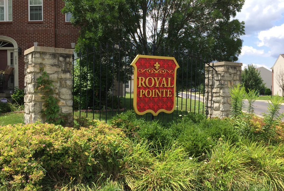
Royal Pointe HMO. Quinter router-carved a brand-new HDU identity sign for a home owners association community in Beavercreek, Ohio.
The HMO asked Select Signs of Dayton, Ohio to replace a vinyl-covered Dibond® sign they’d been using on their front gate. Sunlight had deteriorated it over the course of just a few years, and the owners wanted something more high-end that would better match their buildings. “They wanted something more durable they wouldn’t have to worry about over the next fifteen to twenty years,” says Quinter.
His shop got involved after being asked by Select Signs to build it from their design. In fact, they have been doing wholesale work for Select Signs for about four years now.
Quinter is really excited to acquire more wholesale work nowadays. “This allows us to concentrate on making signs, which is what we love doing,” he says. “There’s a lot less legwork involved with trying to secure permits and performing installs.”
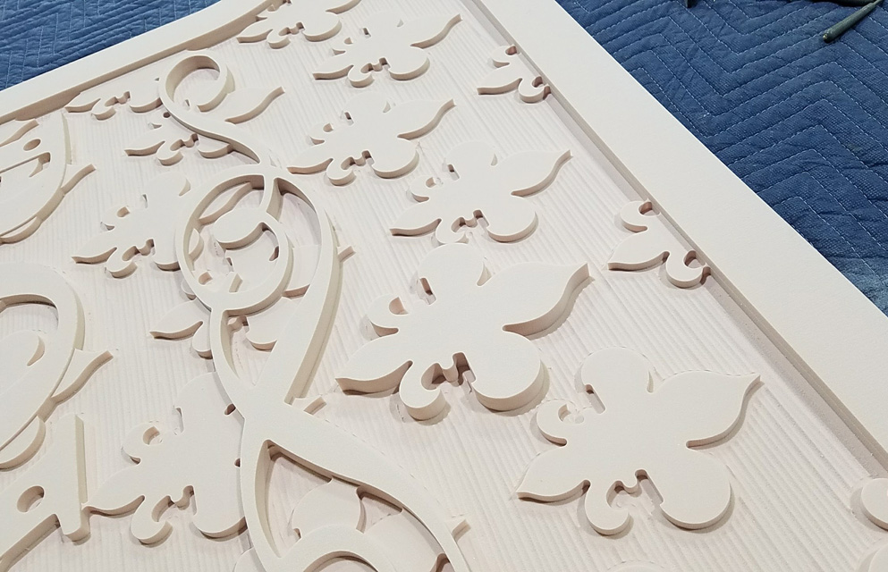
Select Signs supplied them the vector design, which featured numerous fleur-de-lis patterns throughout. Quinter turned the vector image into a toolpath image carved out on an AXYZ router. The company hand-painted the gold and lighter red flourishes on the sign.
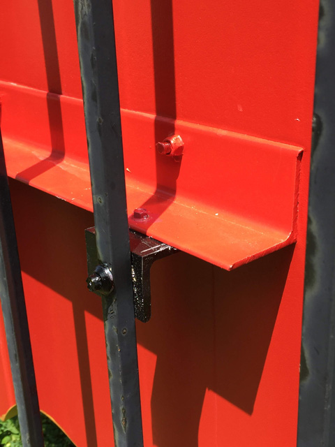
Because the sign was going to be attached to an iron fence, Quint Creative Graphics created custom metal brackets for this sign as well. “We used aluminum angle stock and attached it to the sign with bolts,” says Quinter. “The head of the bolts are hidden under the letters.”
For larger signs lifted up onto a building, they’ll typically screw and bond two-by-fours onto the back sides and make a French cleat out of the top two-by-four. “All we have to do is mount and level our French cleat to the wall, lift the sign, and lay it into place,” says Quinter. “We then hide a few screws in the bottom corners of the sign to pin it down so wind can’t lift it off.
“Any way we go at it, we always hide the fasteners.”
Piqua High School Memorial Garden. School officials contacted Quinter, inquiring about a sign for their new Memorial Garden in front of their campus. This garden represents every student who passed away before graduating from the school. Their names and would-be graduation dates are etched into the brick walkway.
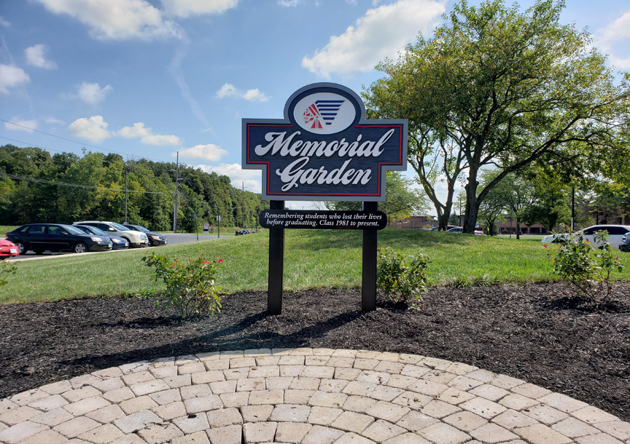
However the previous Memorial Garden had long been neglected and wasn’t getting noticed. Thanks to an influx of grant money, administrators decided it was time to develop a new garden with a more noticeable new sign. “They wanted the sign to be classy yet still fit within the theme of the school,” says Quinter, explaining that his shop designed this sign from scratch after receiving input from the school. “The Indian head is the school’s logo.”
This particular sign features a faux-wood grain textured look on its panel that Quinter has become famous for over the years. “We created the faux-wood grain for the Precision Board panel using Rapid Texture toolpath from Aspire,” he says.
The school’s colors are red, white, and blue, and Quinter utilized them throughout the majority of this sign, however, his shop added gray colors to the outline border to further set it off.
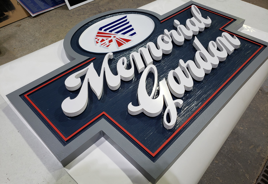
The “Memorial Garden” letters attached to the Precision Board panel are white PVC that Quint Creative stud-mounted to the panel. “This makes it ‘pop’ off the background,” says Quinter.
They used PVC sleeves for the posts and painted them black. They then mounted the sign with screws through the face and painted the heads of the screws to conceal them.
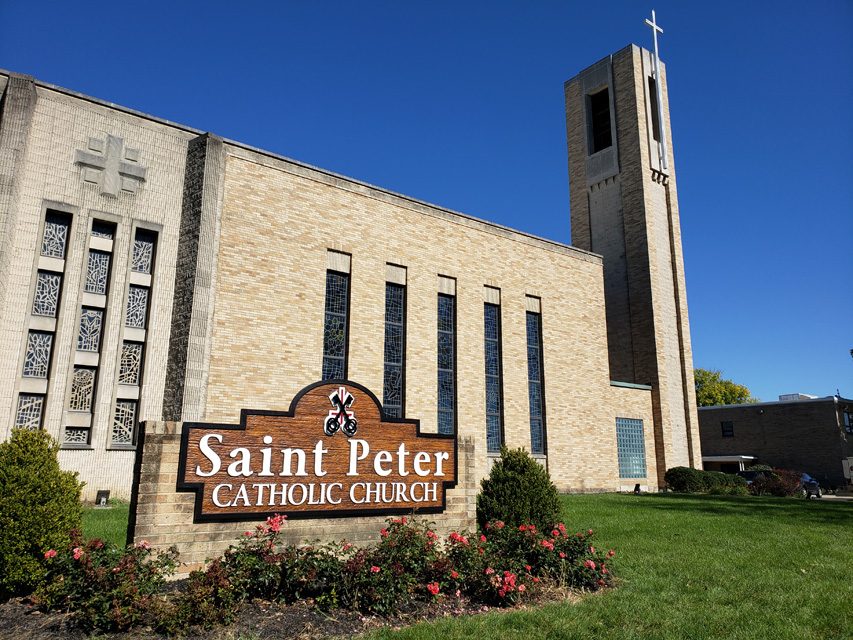
Saint Peter Catholic Church. Quint Creative made two Precision Board signs for this church located in Huber Heights, Ohio—a larger one on the lawn that replaced an existing vinyl-covered cabinet sign and a smaller one attached to the left-side entry casing next to the front doors.
The priest at this church had seen some of Quinter’s faux-wood HDU work in the area and requested that look in the new signs. There were a couple of possible options during the sales pitch. “One was to just replace the sign cabinet with a new face. The other was a new 3D carved sign that resembled wood,” says Quinter. “If we went with the 3D faux-wood sign, I told him I could make some cool custom shapes besides a typical rectangle. This would bring some life to it, and he agreed.”
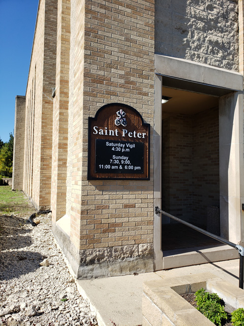
The signs are all one-piece Precision Board carved on the AXYZ router, except for the keys-and-cross icon located on the tops—the keys are PVC, and the cross is Dibond and both were stud-mounted to the panels. The larger sign was made in two pieces and the HDU bonded together.
Quint Creative attached the new sign to the brickwork monument. “We took the existing cabinet off and screwed the new Saint Peters sign directly to the face,” says Quinter.
“Typically we try to find a spot in the grain that we feel we can hide the screwhead. We paint over the heads with a thick layer of paint that we use for the backgrounds, and this hides them.”
—Jeff Wooten


