Last October, Administrative Pastor Ben Overton approached my shop, Synergy Signs & Graphics, LLC in Strasburg, Ohio, with an exciting opportunity—to design an eye-catching sign that would coincide with his Burning River Church’s rebrand. The church felt that, with a new name and logo, this new sign would serve as the centerpiece of their rebrand campaign.
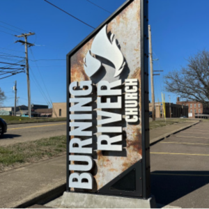
This article will explore the journey of how my shop collaborated with the church to create and install what I feel to be a pretty remarkable sign. After a productive initial meeting with the church, my shop embarked on the design process. We ended up presenting three options to the church. The chosen design—a industrial-looking vertical pylon with a steel surround and rusted background—impressed the church members.
Following some minor design revisions, we received the green light to proceed with production. However, the church is located in Dover, Ohio’s downtown historic district, which meant that we were going to have to comply with additional requirements.
First we had to pass through the architectural review board overseeing aesthetics in the district. Once they approved the design, we then had to apply for a variance from the city council—since the new sign was going to exceed the height limit set by the historic district’s sign code.
Fortunately the variance was granted for this project, and our fabrication process commenced in December 2022.
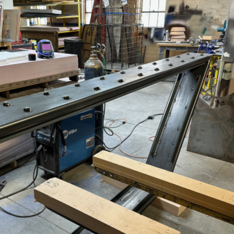
We built the sign’s sturdy frame using 2-by-12-inch steel tubes welded to a 3/8-inch steel plate base. This base was secured on-site to a raised concrete foundation with embedded anchor bolts. Adding to the industrial aesthetic, we welded seventy steel hot rivets to the outer face of the frame.

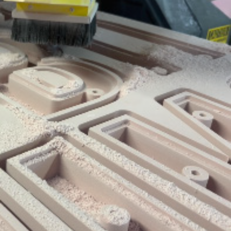
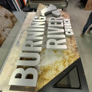
We sanded, cleaned, and coated the entire structure with three layers of automotive-grade epoxy metal primer. For the finishing touch, we skillfully applied a custom-mixed Nova® Color acrylic metallic dark gray paint, using our 3M™ Accuspray™ HVLP paint system. We then hand-painted bronze accents on the rivets, which further enhanced the frame’s visual impact. My shop meticulously crafted the “Burning River Church” channel letters for the sign using two-inch-thick thirty-pound-density Precision Board® high-density urethane (HDU) from Coastal Enterprises.
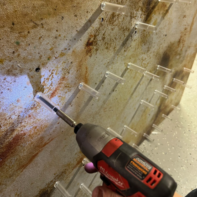
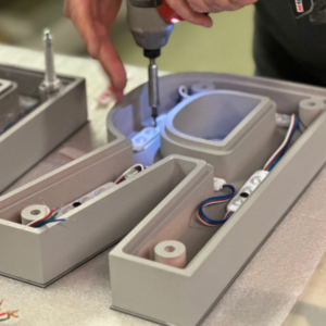
Careful attention was given to carving integral mounts into the backs of the letters. These mounts serve as receptacles for the MBS stand-offs, which we used to securely attach the letters to the sign faces. Furthermore we carefully pocketed out the letters to accommodate 150 Hanley LED Peregrine Series RGB modules. This design allows for mesmerizing color-changing halo lighting and creates a captivating visual spectacle during night-time hours. Because of this, we applied a 3/16-inch polycarbonate lens to each letter back.
Our Multicam 3000 Series router, equipped with X-Edge router bits, ensured precise drilling for all the mounting holes and electrical supply points, making final assembly effortless. The original design called for rusted steel backgrounds; however we desired a little more control over the aesthetics.
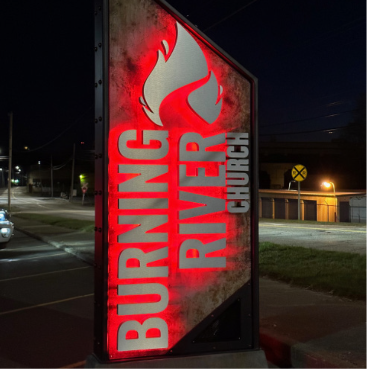
To achieve the appearance we wanted—while still maintaining control over color and rust effects—we opted for faux finishing AlumaCore faces. Applying six coats of Nova Color paints and glazes allowed us to create an authentic rusted look. This decision ensured the sign’s appearance aligned with Burning River Church’s vision and provided long-lasting durability. The sign’s vertical pylon design, steel frame with rivets, and faux-rusted AlumaCore faces combine to create an eye-catching and impactful visual statement.
The collaboration between our team and Burning River Church resulted in the creation of a truly remarkable sign. From the initial design process to the meticulous fabrication and installation, every step was undertaken with careful consideration and attention to detail. As the centerpiece of Burning River Church’s rebranding campaign, this new pylon piece with the new name and logo has successfully grabbed attention, leaving a lasting impression on both the church’s members and the local community.
Seven months have passed since the sign’s installation, and the response has been overwhelmingly positive ever since. We have received numerous comments and calls from people expressing their admiration for the sign’s captivating design.
The monument/pylon sign stands as a symbol of the church’s rebranding success, as well as their commitment to capturing attention, both figuratively and literally, in their community.
See all pictures from the project below in the gallery!