

The H-E-B supermarket chain is super-popular throughout Texas as well as in portions of northeast Mexico. There are currently more than 340 of these stores located throughout the state, and this past September, a new flagship location opened its doors to the public in Frisco, Texas (believe it or not, the first one in the Dallas-Fort Worth area).
These stores are all about the experience, and the new Frisco establishment is no different.
Inside is a state-of-the-art layout featuring not only a wide range of grocery items but also a pharmacy, a café, a bakery, a lauded barbeque restaurant, and a full home décor department.
And the H-E-B experience is not just limited to the interior.
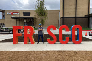
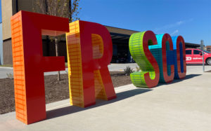
Next door to the store is a two-acre outdoor greenspace that hosts a mosaic tile bench covered with artwork from local artists as well as oversized metal food-related sculptures.
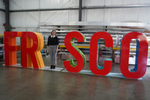
In this area, you’ll also find a centerpiece set of individual five-foot-three-inch-tall aluminum cabinet letters spelling out the “FRISCO” name—well almost. A unique aspect of these letters is that the letter “I” is missing from its middle. This allows guests the opportunity to stand-in as the letter “I” for photo ops.
The letters are various widths—ranging from 2-feet-6.25-inches minimum to 2-feet-11-inches maximum.
Humble Sign Company, a full-service sign company based out of Humble, Texas produced and installed this fun set of oversized letters based off a design provided by H-E-B officials.
The shop’s creative, quality work on plenty of large projects in the area had attracted the attention of H-E-B management headquartered in San Antonio. “They were aware of our reputation for quality and timely delivery,” says Taylor Cordova, marketing coordinator at Humble Sign Company.
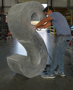
The sign shop began the project by developing structural engineering drawings based off the provided designs.
The two-week build process involved a CNC router to cut the faces and a roller for the sides.
Initially H-E-B officials requested slats resembling nearby railroad tracks to be featured on all sides of all the letters. They wanted these faux tracks to be seen by onlookers no matter their viewing angle. This caused a pause early on for further consultation. “We ended up applying a two-tone paint job that resembled slats,” says Cordova.
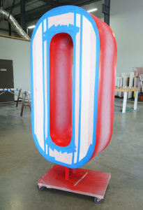
The letters were painted in various colors using a satin finish. The fronts were painted with PANTONE® 485 C red, while the sides feature various PMS hues of oranges, yellows, greens, and blues. Humble Sign Company added an application of a clear, high-performance finish resistant to graffiti, chlorine, and salt water exposure to all the letters.
H-E-B officials wanted the letter set to look like they were flat on the ground, however they did not want visible fasteners used to accomplish this. To solve this challenge, Humble Sign Company created a sleeve system that allowed them to slide the letters down an oversized bolt they had mounted to the ground.
The letters were secured to the ground via two-inch steel tubes and six strategically placed 6.5-inch-by-10-inch, 1-inch-thick steel plates. The “F” uses an eighteen-inch-tall steel tube, as does the left-hand side of the “R.” Meanwhile the right-hand side of the “R” as well as the mid-sections of the “S,” “C,” and “O” use eight-inch-tall steel tubes to sturdily help with placement.
Humble Sign Company installed the letters, as well as bonding and grounding them, in accordance with the requirements of the National Electrical Code and other applicable local codes.
“The most important tools we used during the install were our crane trucks and concrete anchors,” explains Cordova.
One question you may have: So just why did H-E-B officials want to leave the “I” out of the FRISCO letters at this new store? The answer—interactivity!
“H-E-B is great at creating an experience out of something as mundane as grocery shopping, and this interactive piece adds to that experience,” explains Cordova. “On the flipside, leaving the ‘I’ out is brilliant marketing because many guests upload photos of themselves posing as the ‘I’ online, which adds buzz and excitement to the store.”
H-E-B and its Frisco customers are thrilled with the letters Humble Sign Company provided here. “We love seeing people enjoy our signage and posting their photos online!” says Cordova. “Usually after we install a sign, we may get a five-star review or see one picture of it online. But with something of this magnitude, there are new pictures daily!
—By Jeff Wooten


