Thanks to their popular house-roasted and hand-crafted offerings, Winans Coffee & Chocolate promotes itself as a “coffee shop with a chocolate heart.” The establishment has, in fact, enjoyed quite the rich history.
Max Winans co-opened the first location of the (then) chocolate factory-and-shop with his brother back in 1961 in Piqua, Ohio. Their success led them to expanding their presence to eighteen other factory-style storefronts across the state and eventually adding coffee to their menus.
Current owner (and Max’s grandson) Wilson Reiser took over seven years ago and has done a masterful job combining the classic atmosphere of the establishment’s origins with today’s tastes.
Reiser recently undertook a successful rebrand of Winans Coffee & Chocolate. He also made the decision, during this time, to open a twentieth location in the downtown area of Lima, Ohio.
Reiser had already turned to award-winning Quint Creative Signs of Piqua to update existing signs with the new rebranding at several of his other stores when he brought up the idea of creating brand-new signage for the new Lima location. He solicited the custom sign company for ideas that would combine the rebrand with the classic feel of the Winans factory-and-shop.
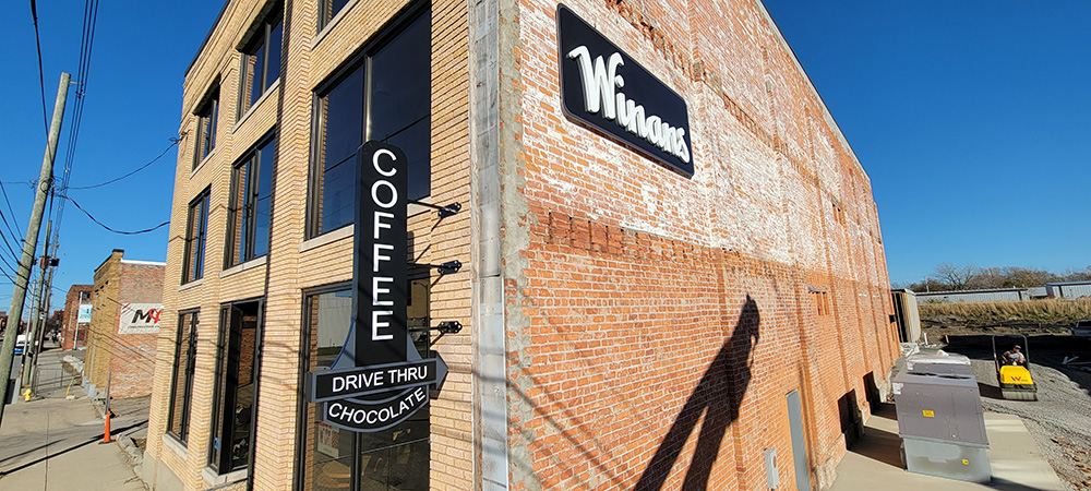
Lima’s downtown is undergoing a lot of renovation and rehab in an appealing effort to attract both retailers and consumers. The new Winans Coffee & Chocolate was going to move into a long-standing brick building recently remodeled for new multi-tenants.
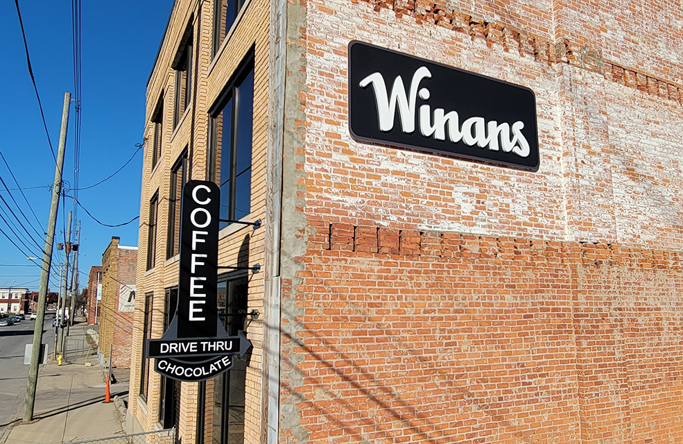
After some back-and-forth brainstorming, Quint Creative Signs agreed to fabricate and install a new set of retro-feeling perpendicular signage for the new Lima location—an all-HDU blade sign projecting off the brick building as well as a separate wall sign hosting raised HDU letters.
“Winans is going to be one of the anchors in the building,” says Quint Creative Signs President Brian Quinter. “They are also going to have the ability to host a drive-through at this location as well, so it was important to them that the phrase ‘drive-thru’ be incorporated into the signage.”
Quint Creative Signs submitted a few preliminary designs for the projecting blade sign. The new Winans Coffee & Chocolate branding uses a Script font for its name, which posed some challenges to overcome. “When we presented the ‘Winans’ text at a horizontal orientation, it ended up being too small to read,” explains Quinter. “And when the text was positioned vertically, there was odd open space above the lowercase letters that just didn’t look very good.”
Quinter proposed the idea of breaking up their logo/message and just having the “Winans” name on a large wall sign and a hierarchy of the words “Coffee,” “Chocolate,” and “Drive Thru” on the blade sign. After further consultation, the Reiser opted to go with “Coffee” as the lead-off for the latter followed by “Drive Thru.”
“The overall design comes from my love of old signs and new retro-type signs in historical sections of cities,” says Quinter. “This [perpendicular, two-sign] concept worked very well here because the new Winans Coffee & Chocolates building is located on a one-way road.”
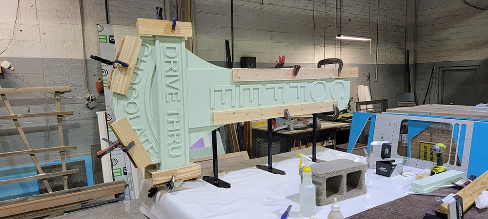
The projecting blade sign measures 42-by-84-by-4 inches and was constructed in three layers—two faces and a core. All the layers were created out of fifteen-pound-density Duna HDU. “We’ve always had really good luck with fifteen pounds and never felt the need to have denser HDU for our projects,” explains Quinter.
Quinter says that all the letters on this piece are integral to the faces of the sign. Quint Creative Signs set up the tooling process in Vectric Aspire then used their CNC router to carve the sign faces and raised letters out of the HDU material.
Due to a short turnaround and a longer distributor lead-time for the Durabond joint compound they typically use, Quint Creative Signs employed expanding Original Gorilla Glue™ to bond all the layers together.
They had built and placed a welded steel frame inside the projecting blade sign that permanently bonded when the three layers were put together.
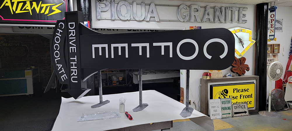
Quint Creative Signs used their CNC plasma cutter to create the pads for the bracket frames. “The plasma cutter allows us to create any shape we want on certain elements on our brackets,” states Quinter. “We cut the mounting pads to shape and welded them to the frame.”
After everything finished bonding, Quint Creative Signs clamped the sign and screwed everything together.
Before painting anything, they filled any lines that showed up in-between the layers with additional Gorilla Glue.
Quint Creative Signs fully painted the projecting blade sign with Sherwin-Williams and Nova paints. They used a spray primer and the main background color. “All of the other painting was done by hand with a combination of rollers, brushes, and foam brushes,” says Quinter.
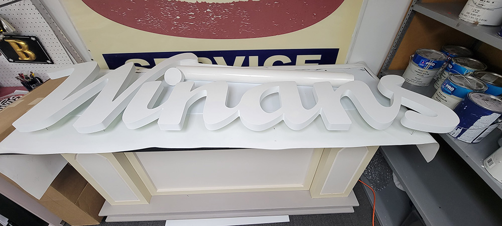
Meanwhile the raised-letter “Winans” wall sign measures 120-by-48 inches.
Unlike the fully painted projecting blade sign, the background of this wall sign was created using printed and laminated vinyl. The HDU letters were the only portion of this sign painted (again primed with Sherwin-Williams and Nova paints).
Quint Creative Signs used their CNC router to produce the 1/2-inch-thick, 15-pound Duna HDU letters for the wall sign. They machined the letters face down then pre-drilled holes into the backside of the sign panel.
“We used bantam anchors to attach the letters and installed screws through the backside of the sign,” explains Quinter.
The sign panel they were creating was larger than what the shop’s CNC router could handle; this meant they couldn’t pre-drill it. To solve this, the vinyl film applied to the face had all the hole locations printed on it to guide them where to drill.
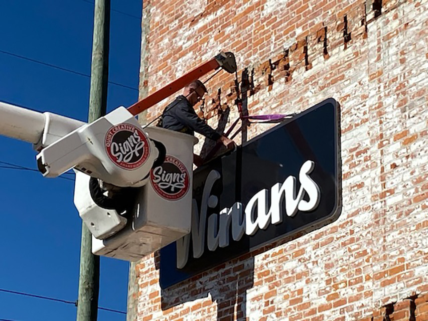
Since the location was an hour away from their shop (and the projecting sign still being finished in their shop), Quint Creative Sign’s original plan was to install the wall sign first, leave their bucket truck on-site, and then come back the following week with the blade sign.
However there were too many contractors working on the building at the time, making the job site too active for this type of install. They didn’t have anywhere to set up their bucket truck nor could they safely park it on the street for a few days. This situation necessitated having to reschedule the install of both signs for a day when all the contractors had finished and left the site.
“We made sure that the area was cleared off for us to install the signs,” says Quinter. “We also made sure we wouldn’t be in any of the contractors’ way or that any contractors would be working right were we needed to lift the signs.”
Quint Creative Signs eventually used the material handler/power jib on their bucket truck to lift both new signs into place.
The new signs successfully capture the look and feel of the sixty-plus-year history of Winans Coffee & Chocolate while employing modern techniques and finishes. Both are perfectly designed and perfectly made concoctions for their location.